Background.
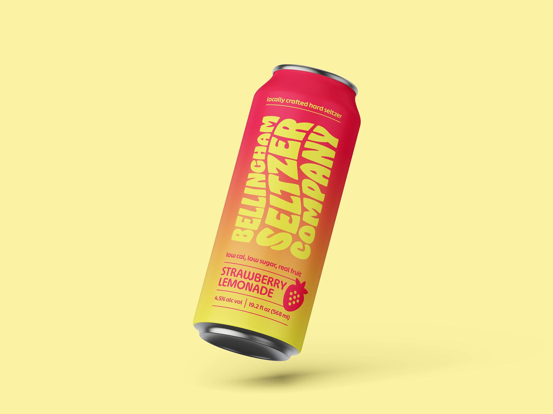
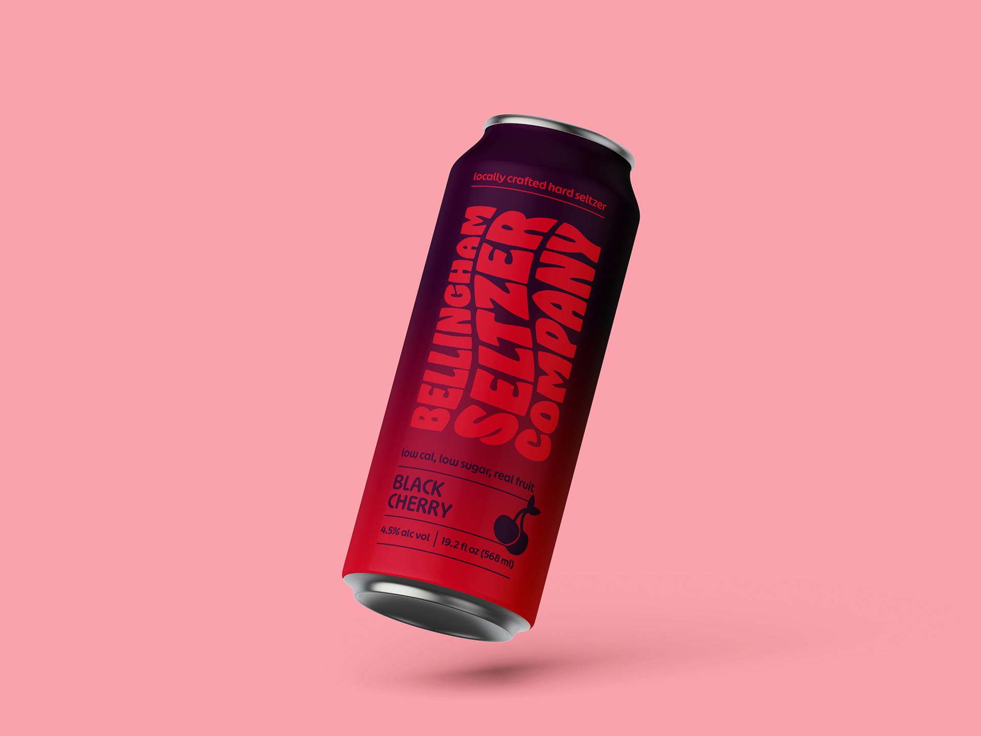
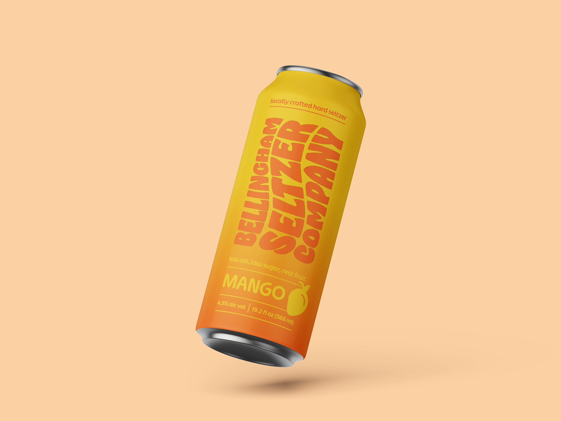
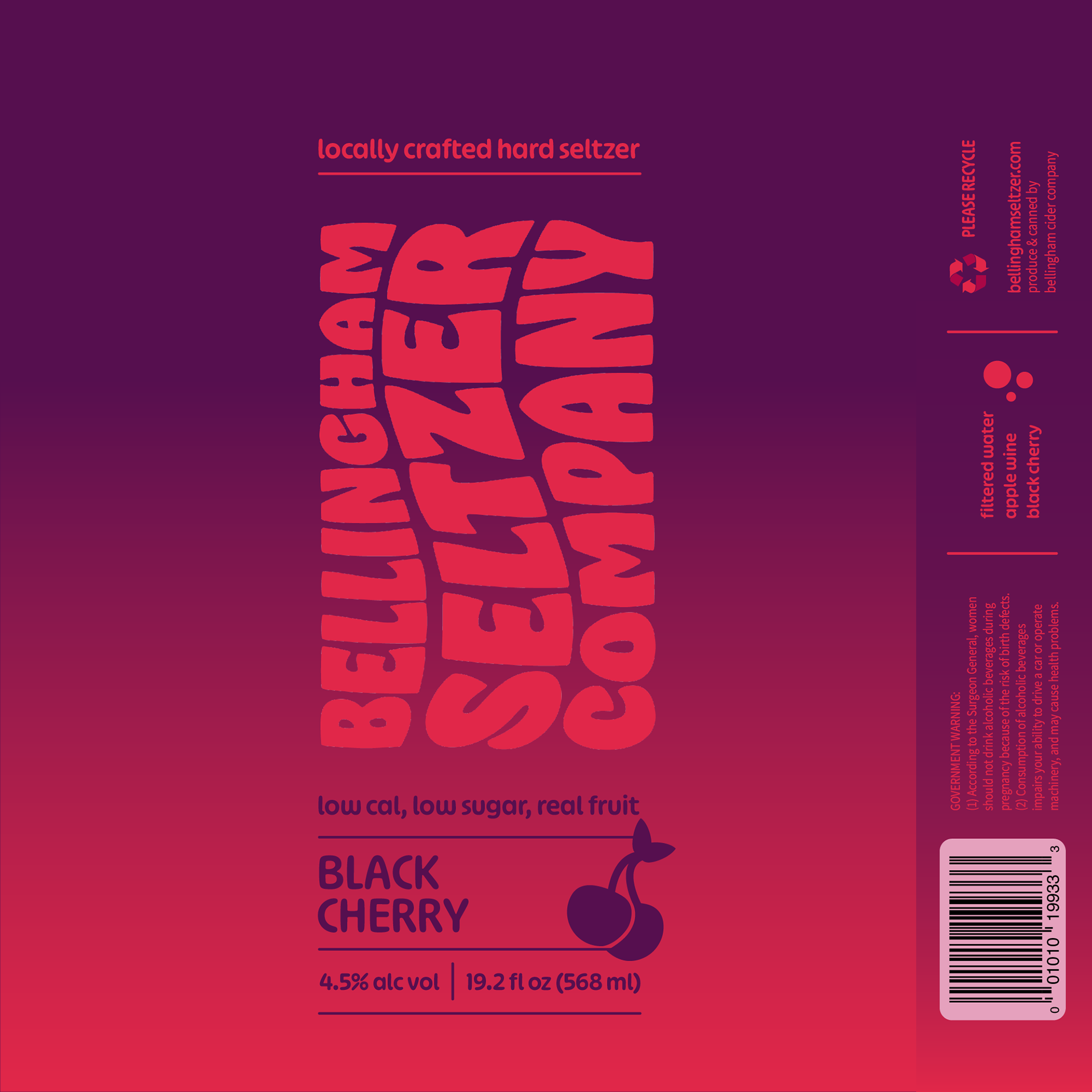
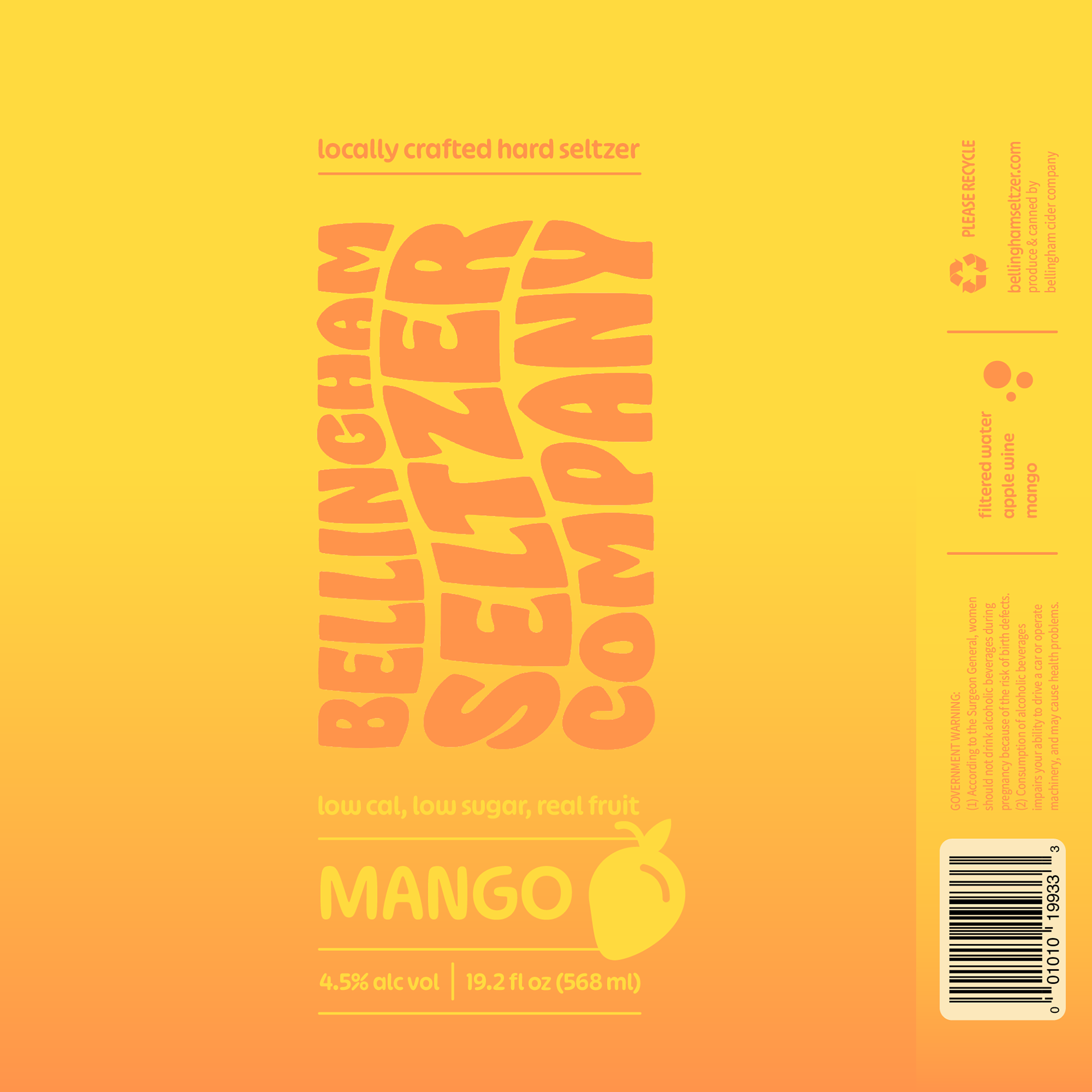
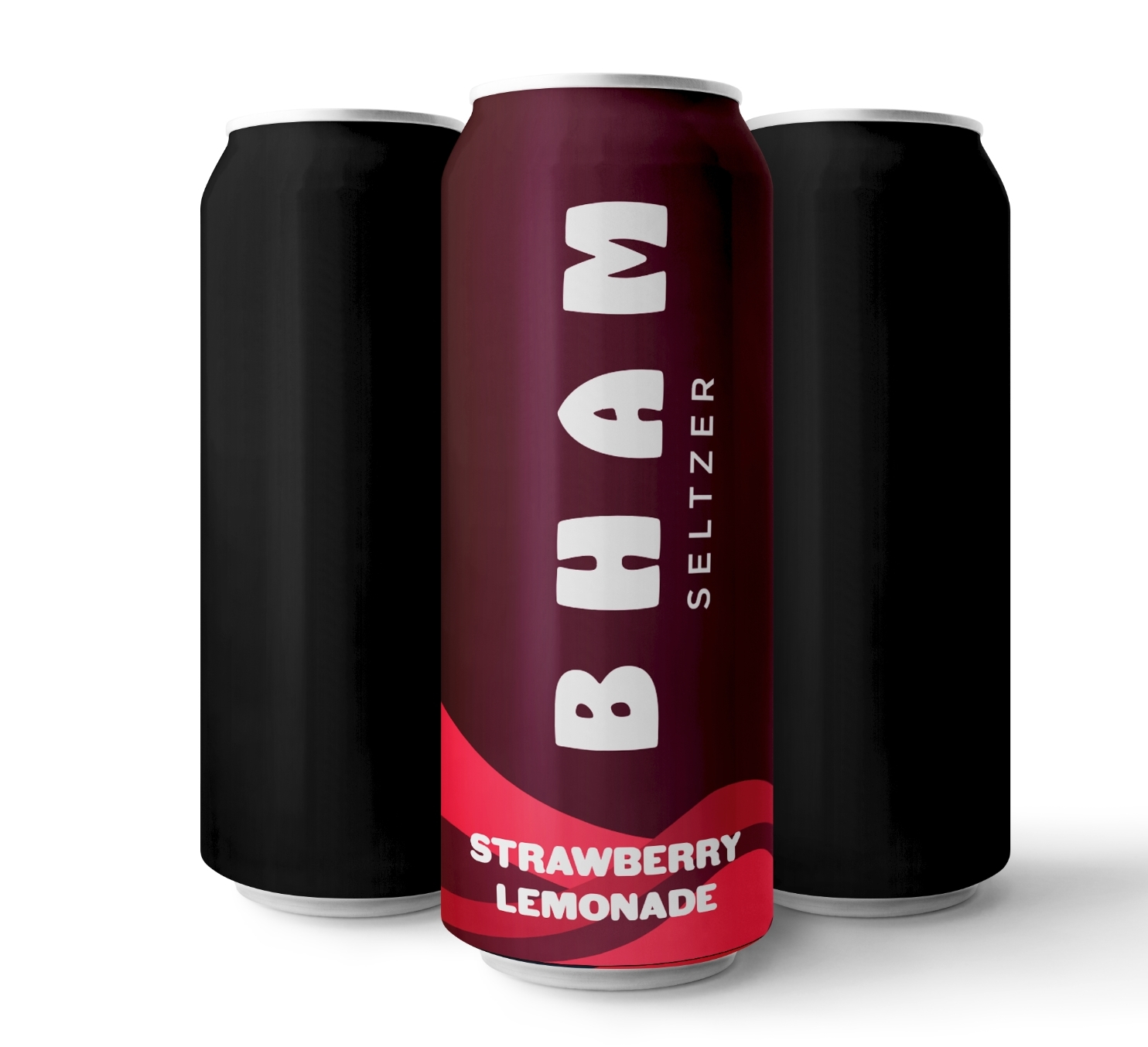
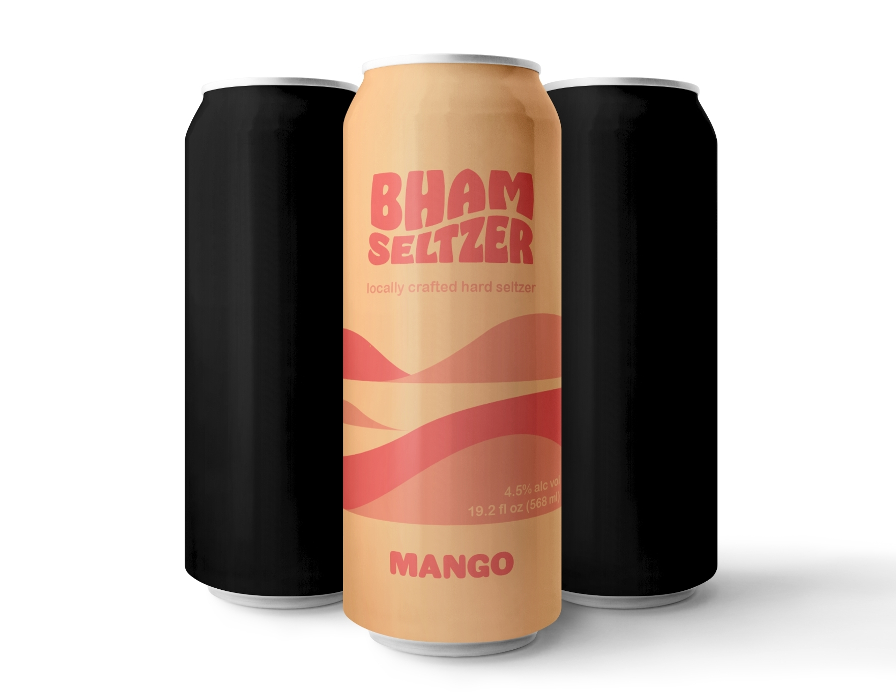
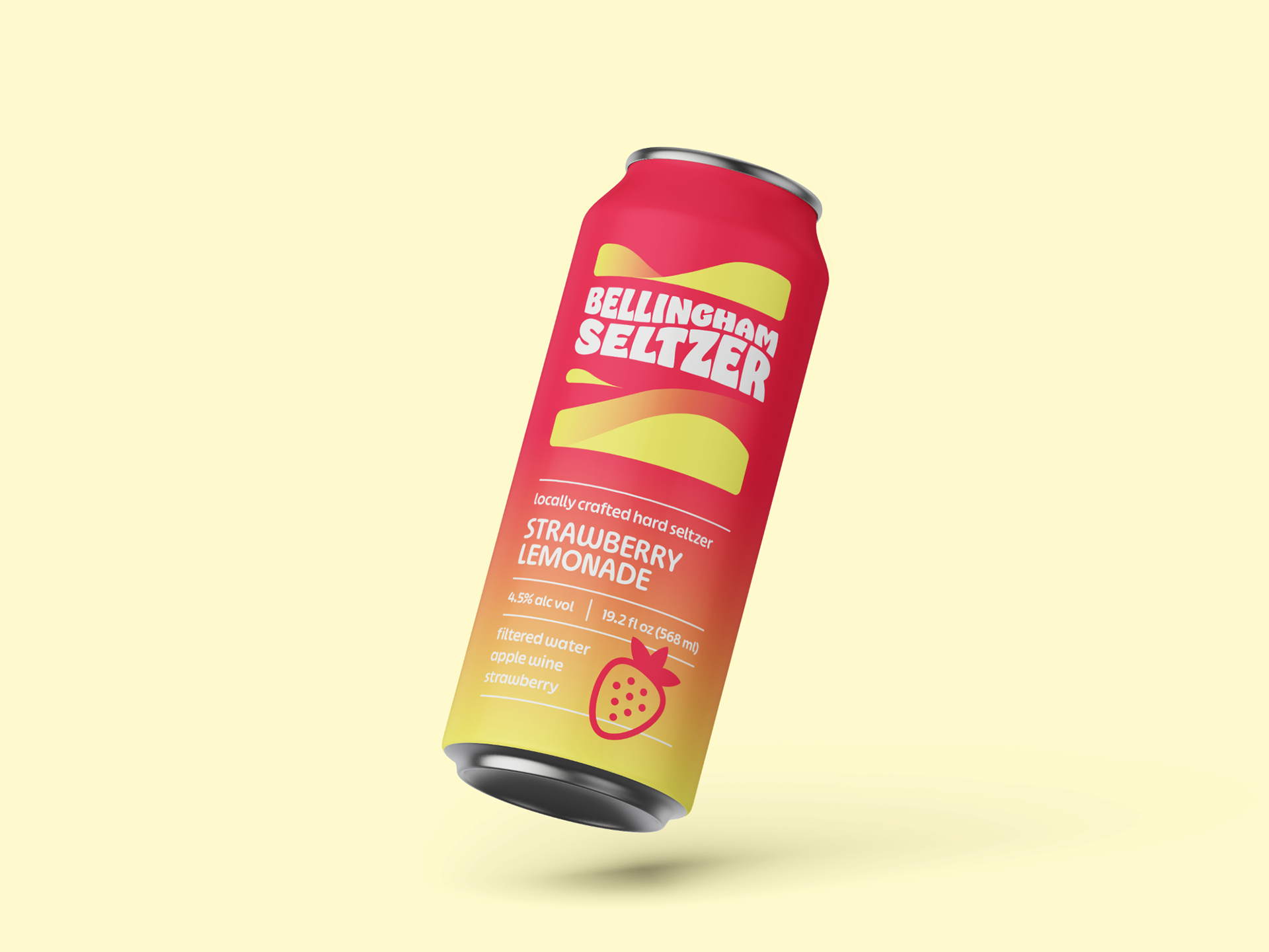
For this project, I redesigned the product packaging for the Bellingham Seltzer Company, a hard seltzer beverage producer. The objective was to create a design that stood out on shelves and highlighted the boldness of its flavors. Through research and iterative design processes, I developed a packaging design that effectively represented the Bellingham Seltzer Company and its offerings.
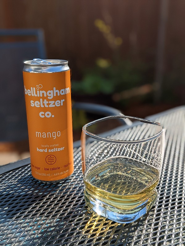
I was allowed to choose any product and attempt to improve its packaging design. I picked Bellingham Seltzer Co. because it already had a nice foundation with its simplicity and bright color, however, I felt the typography left some room on the table. Although a simple, center justified list looked clean, it felt formal, which for the younger demographic of a seltzer brand just didn't add up. Ultimately, the goal of my re-branding strategy was to enhance the typographic presentation to appear more lively and exciting, while still staying true to the great color and simplicity of the can's original design.
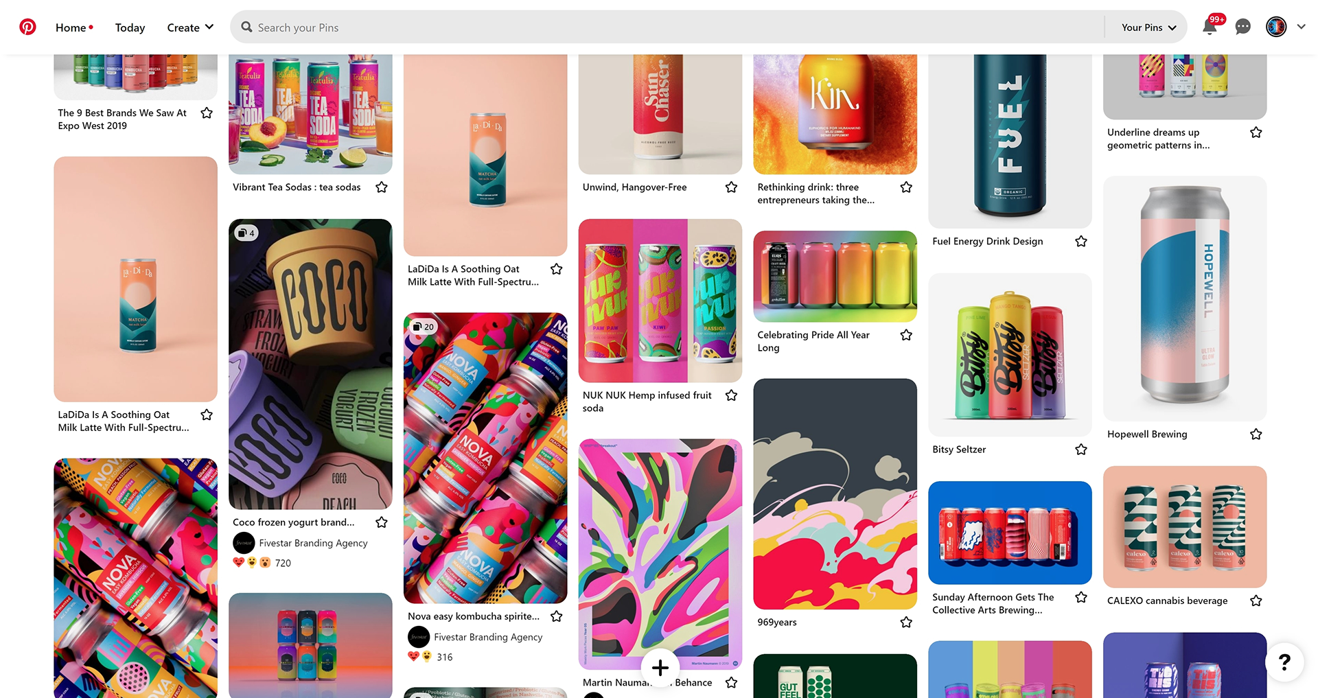
Mood Board
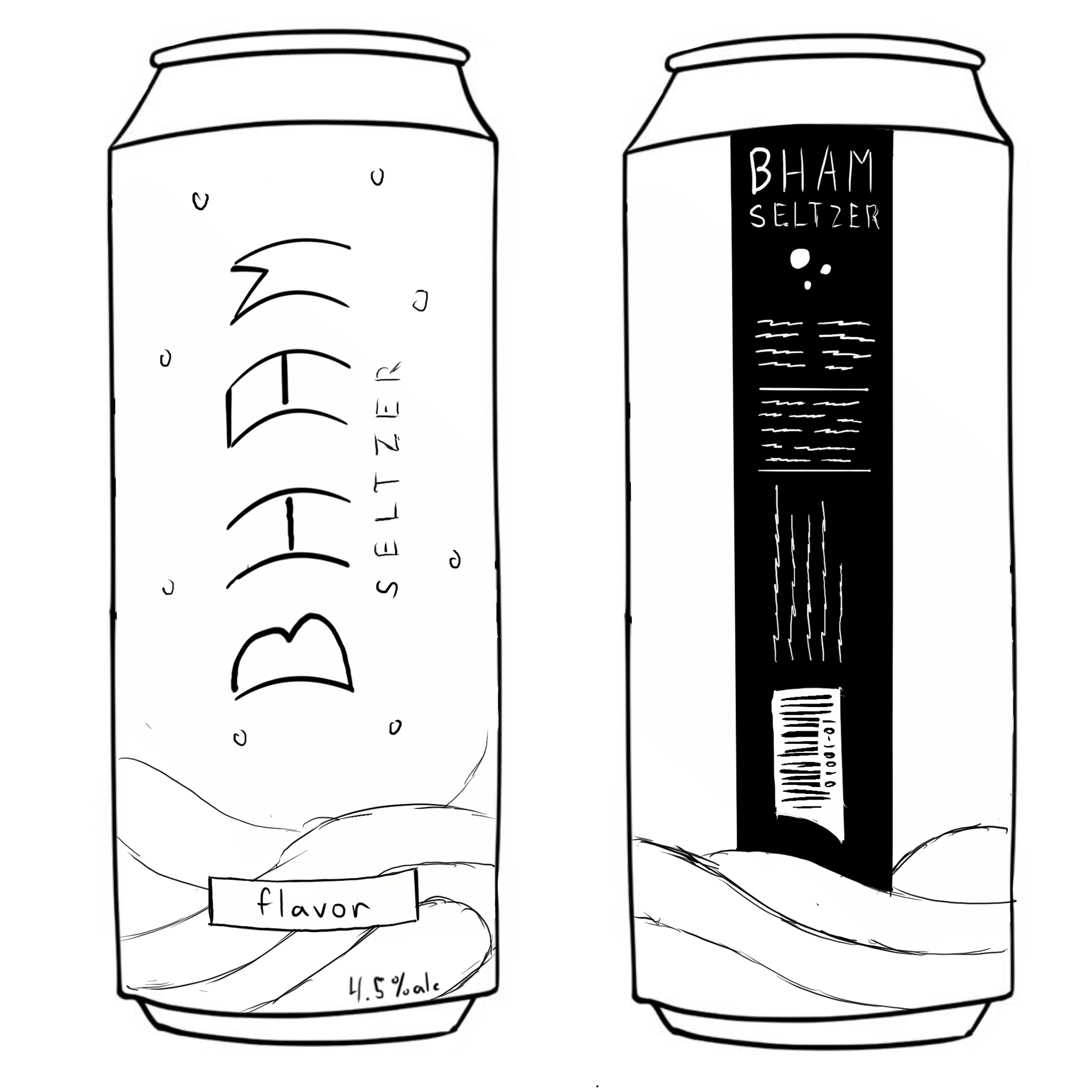
Sketches
Early Drafts
Later Drafts

Final Ver.