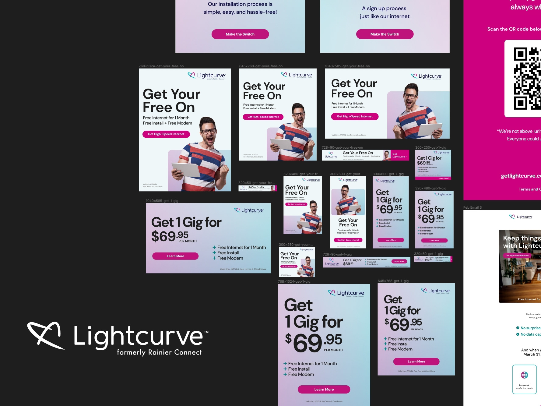
Background.
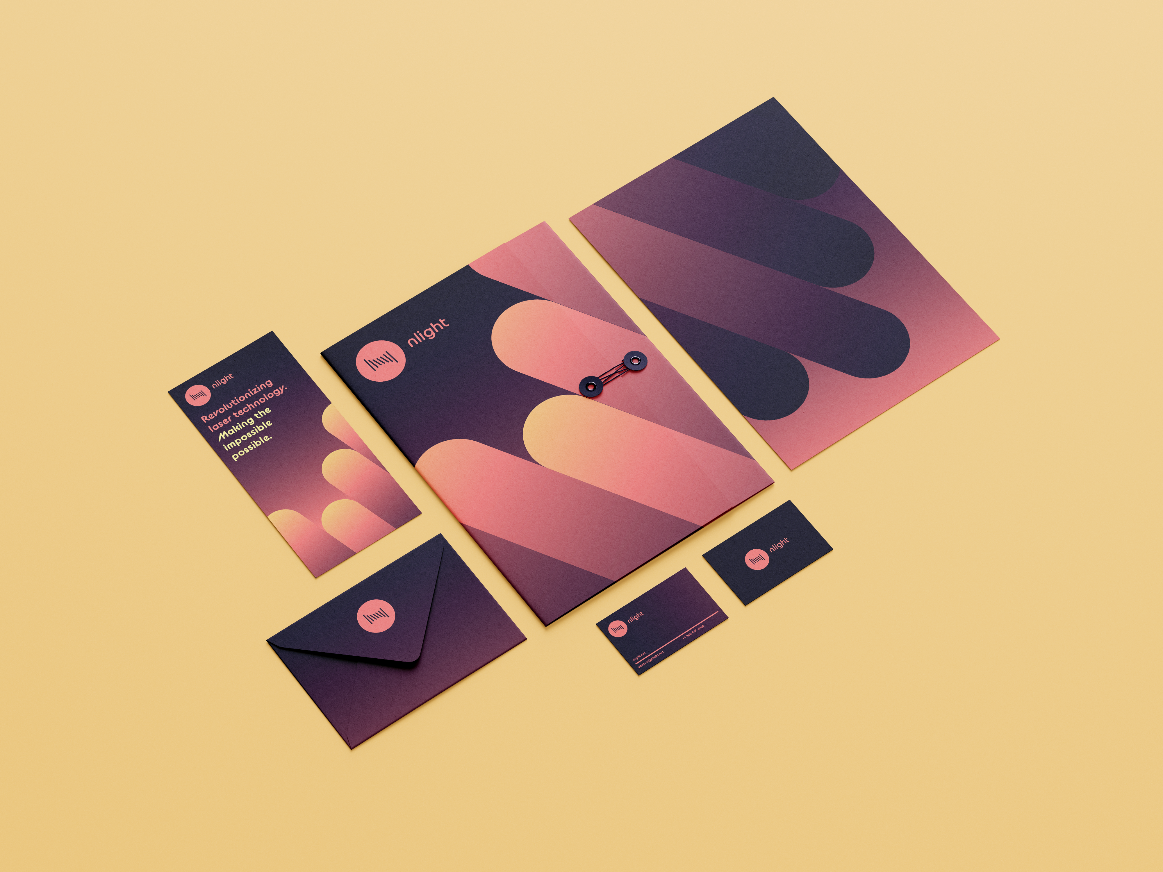
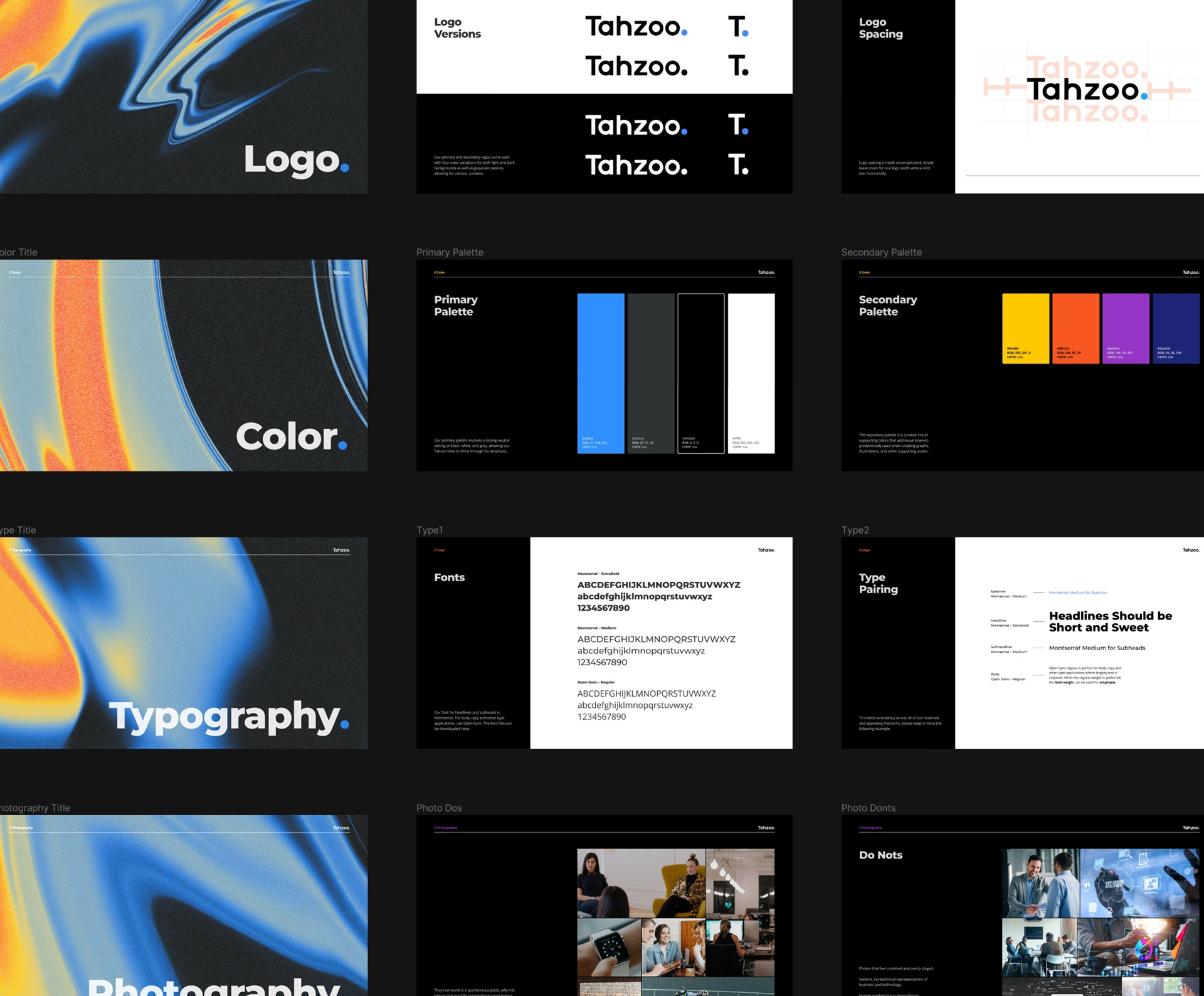
Tahzoo needed me to create new style guides for the brand. I created a comprehensive presentation showcasing all aspects including logo treatment, color usage, typography, photography, data visualization, and art assets.
Design Decisions and Problem Solving
I embodied Tahzoo's ethos of being cutting-edge, user-centric, and dynamic. This meant reassessing the brand's visual and communicative elements to ensure they spoke to these qualities. Every decision was rooted in the question: "How does this serve the brand's narrative and functionality?
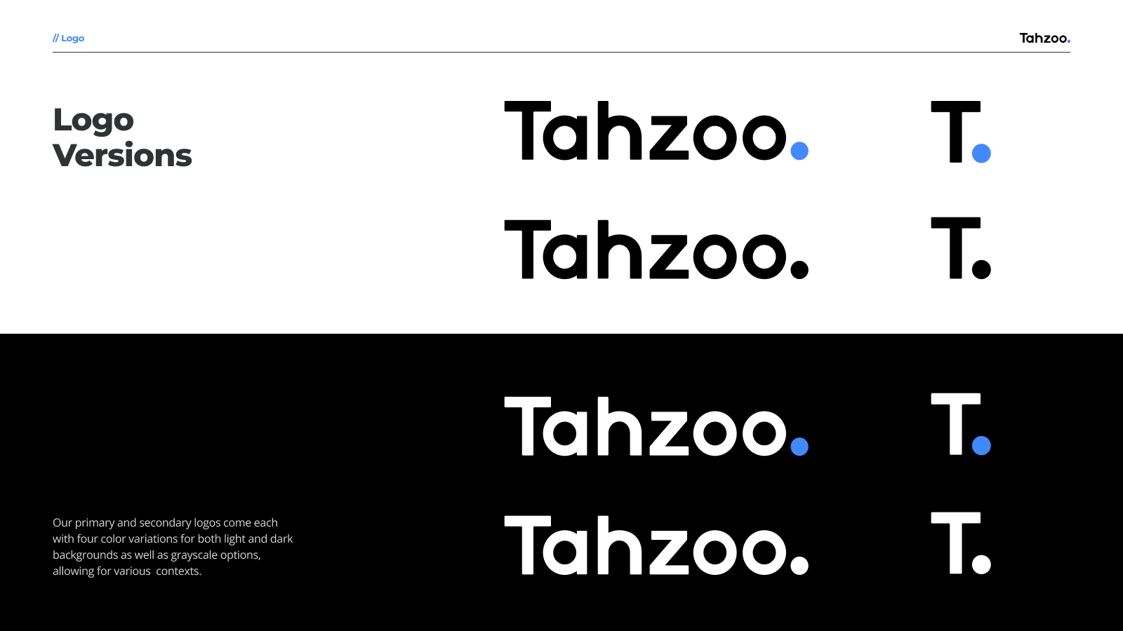
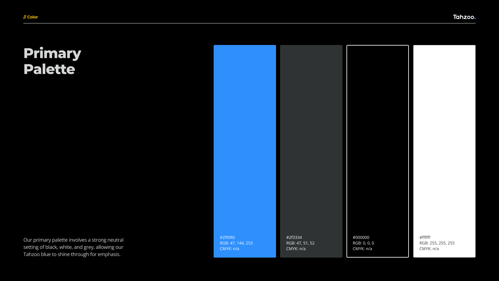
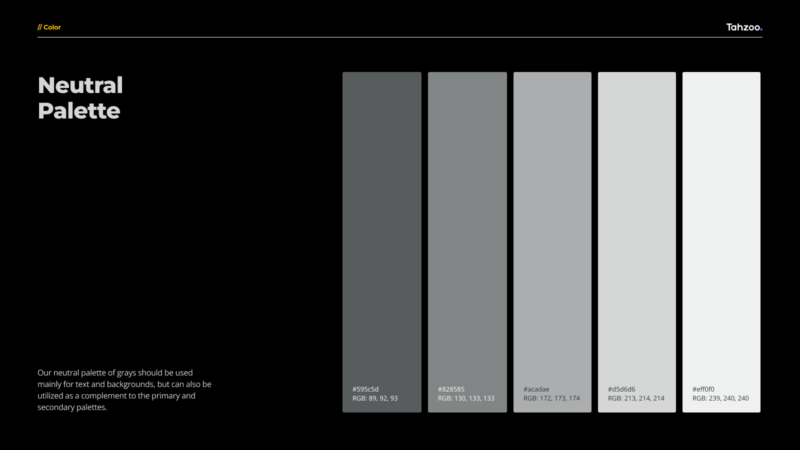
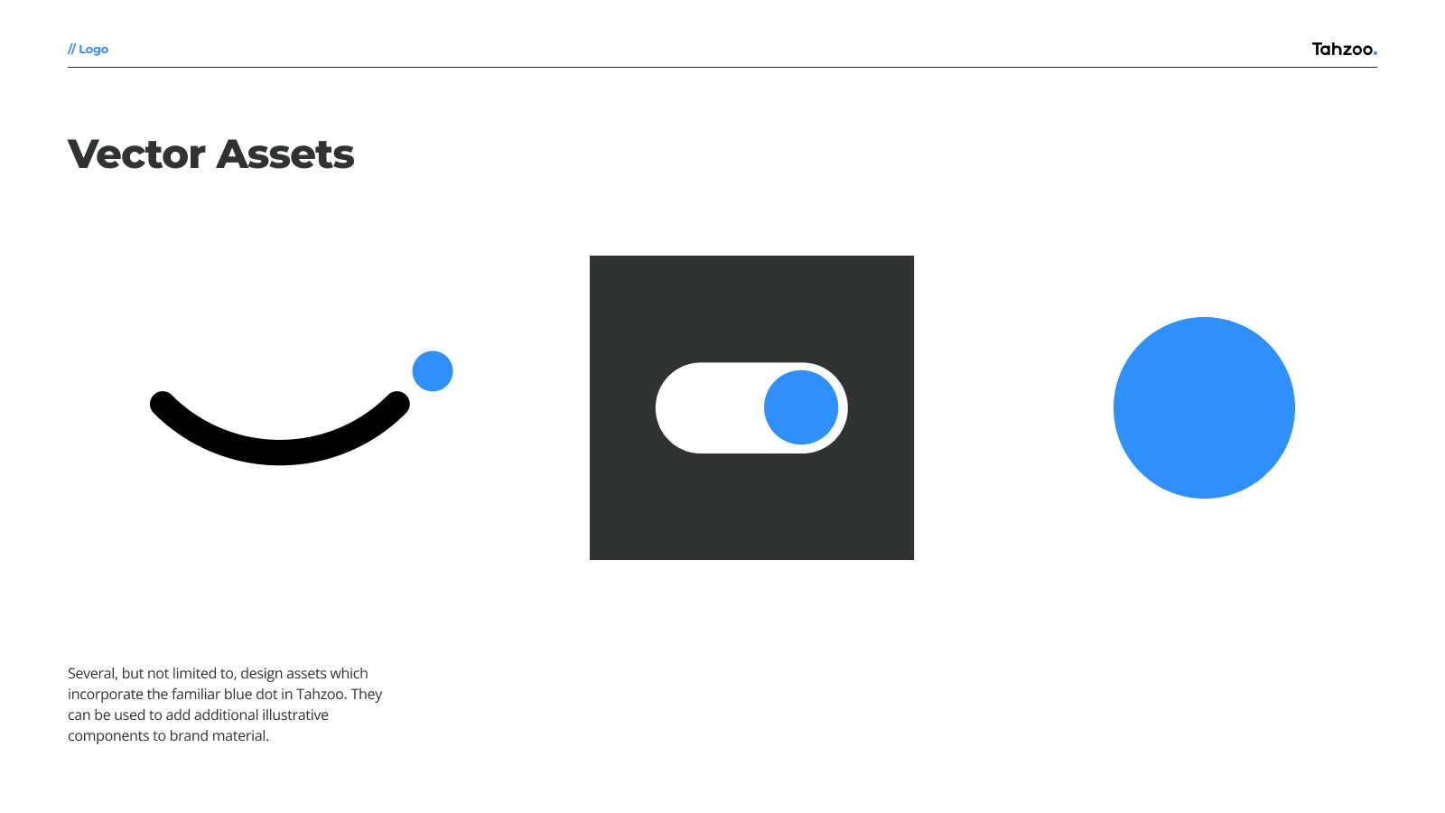
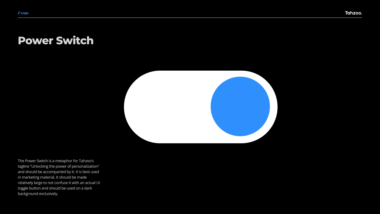
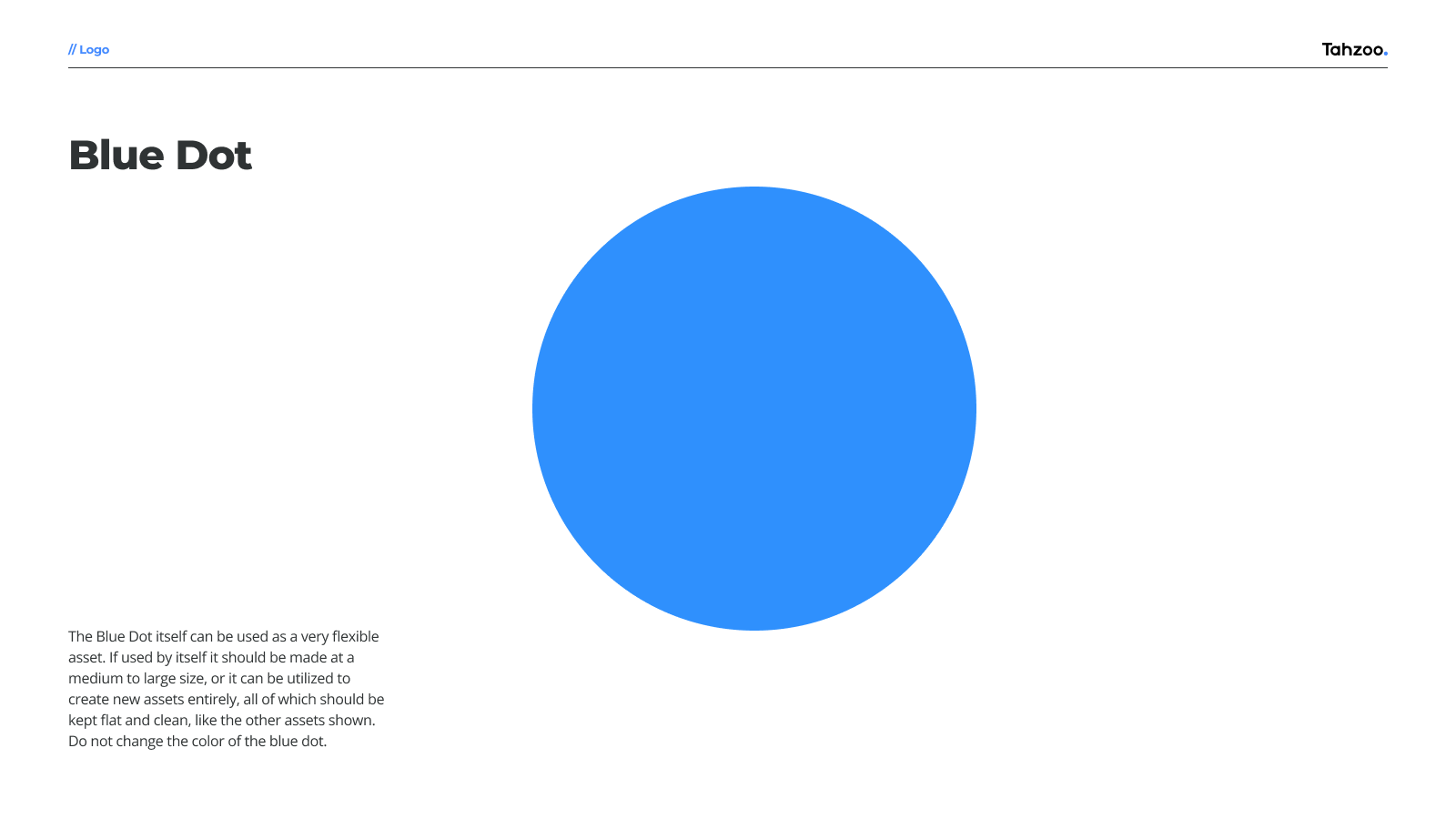
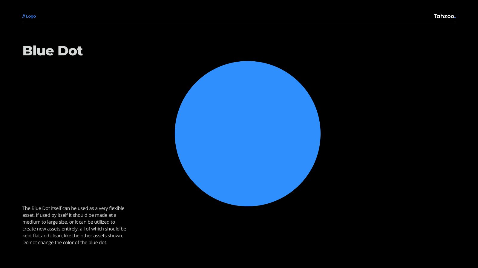
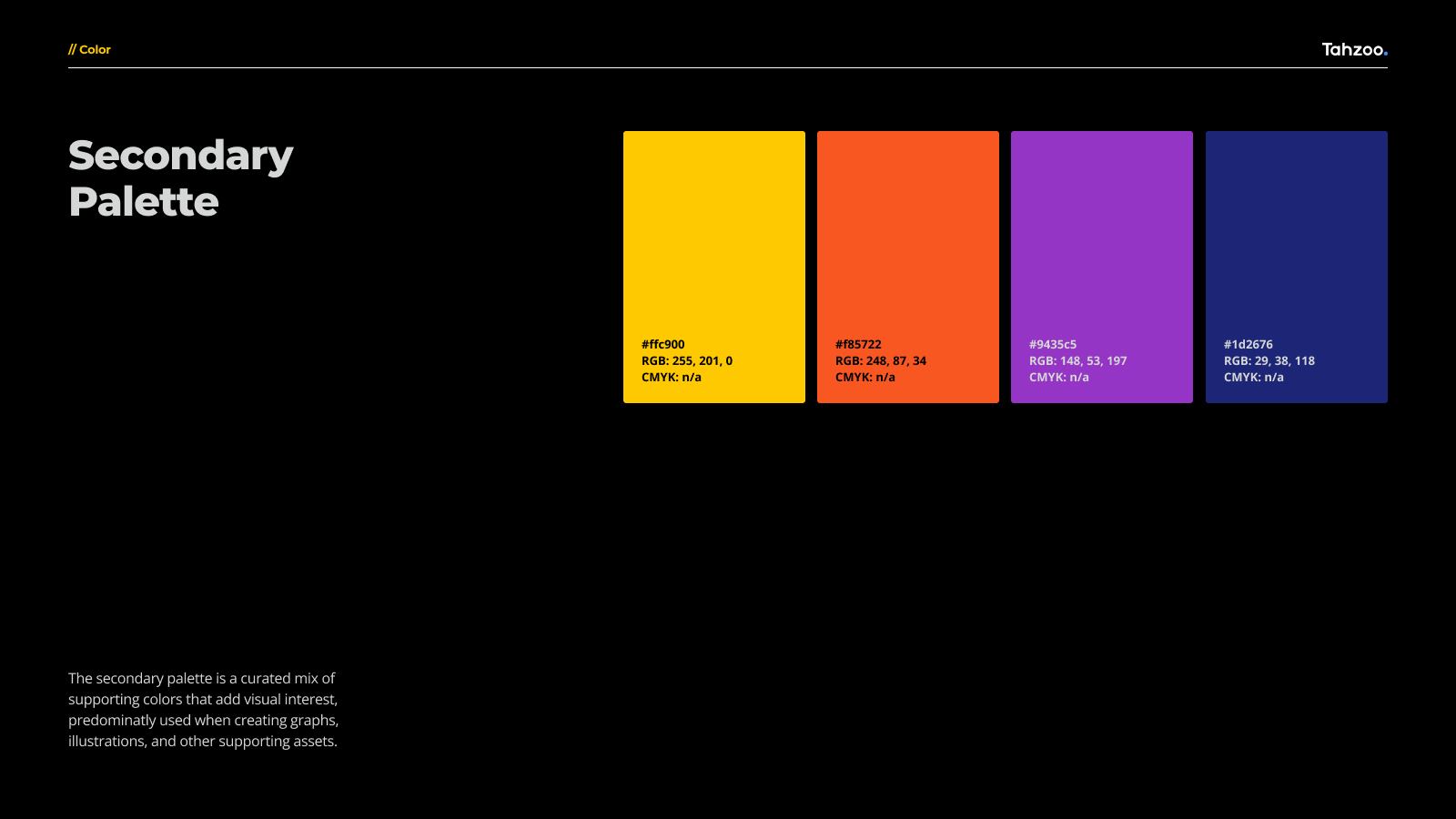
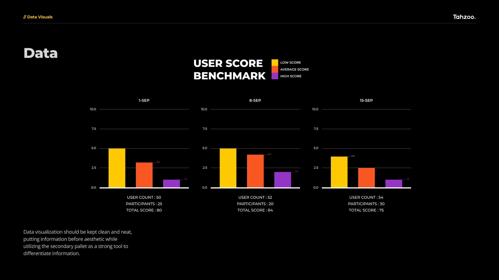
For instance, the use of the color palette was deliberated extensively. The palettes themselves were taken from Tahzoo's existing brand, with the vast majority of assets using black or white while incorporating a new secondary palette to help in visualizing data.
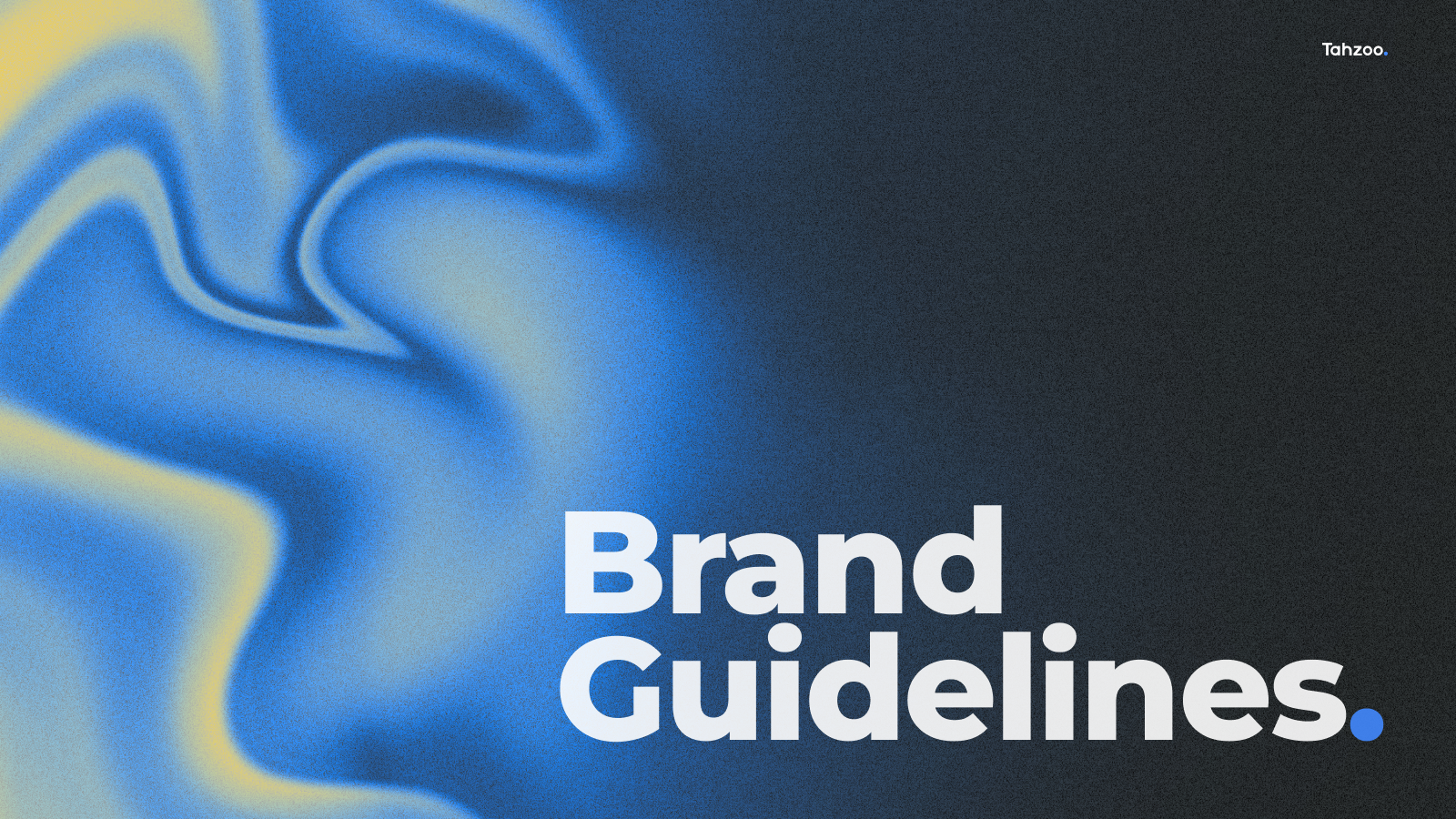
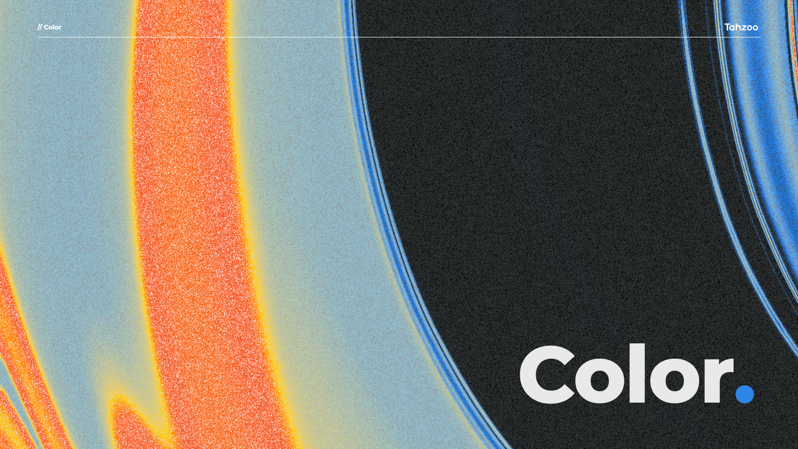
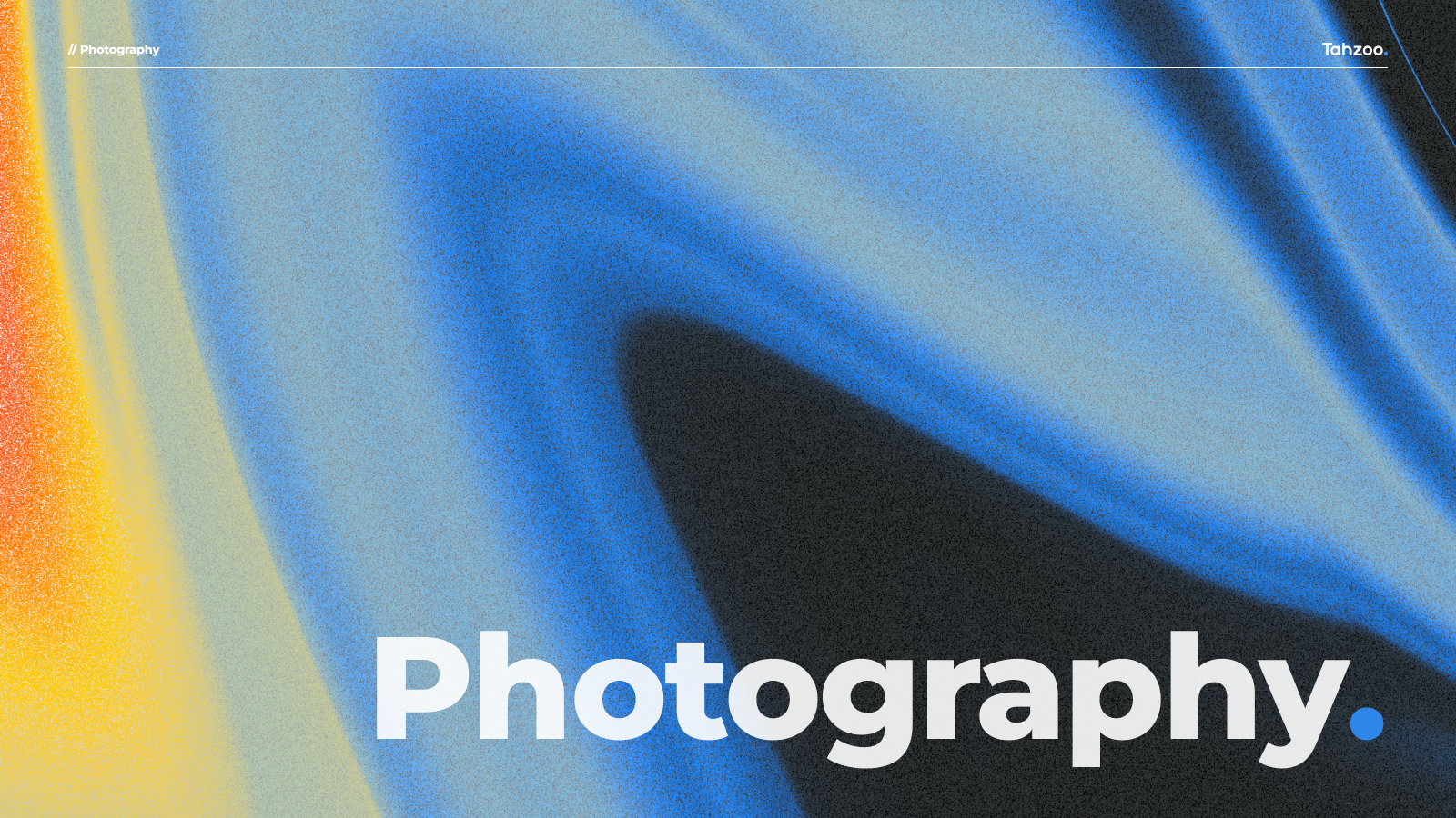
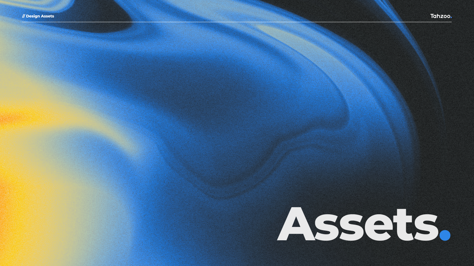
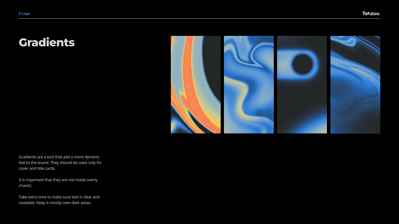
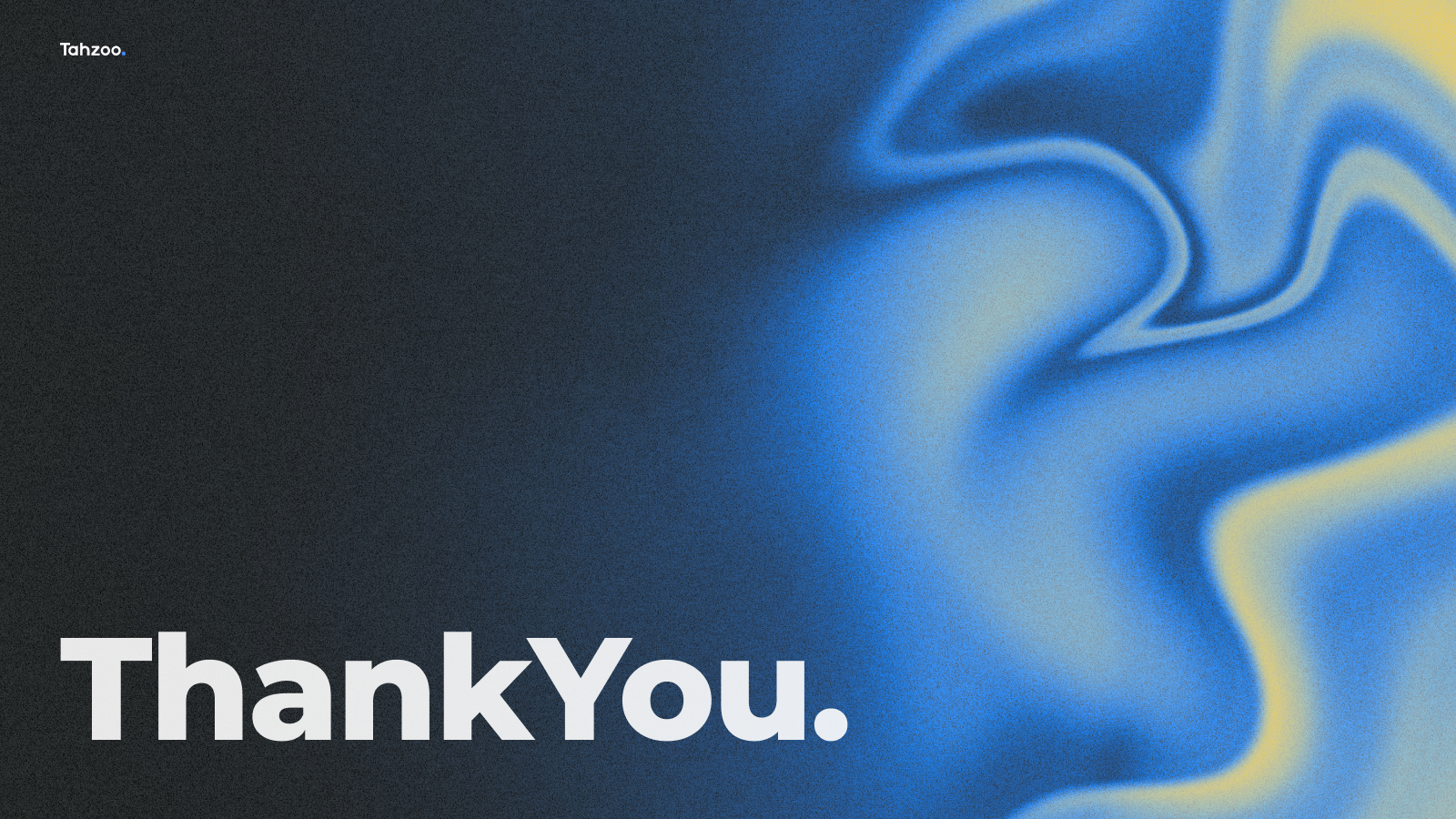
Title pages grab the attention of an audience by using dynamic gradient shapes and vibrant colors.
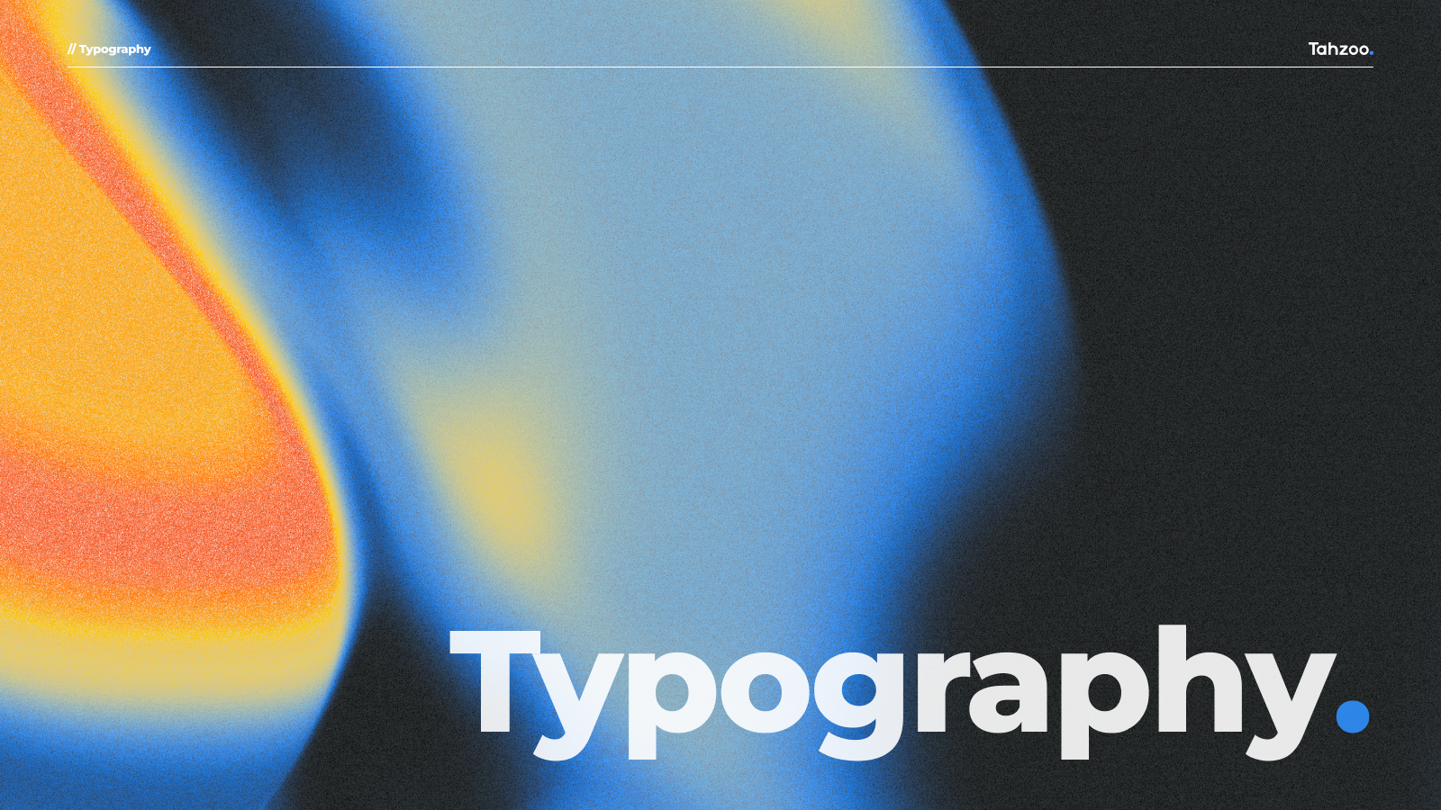
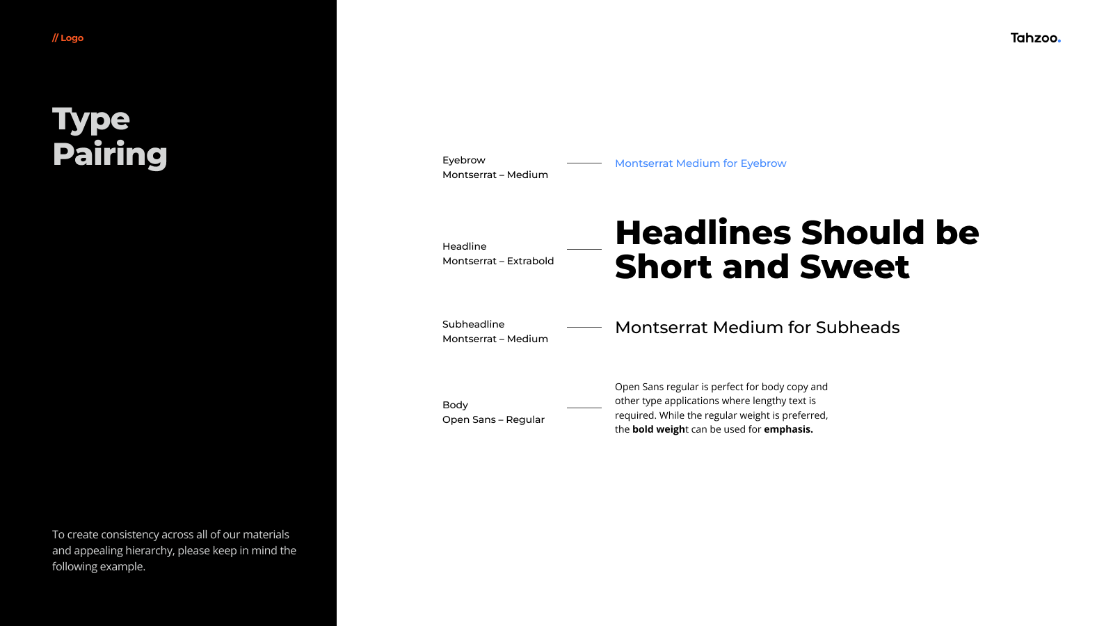
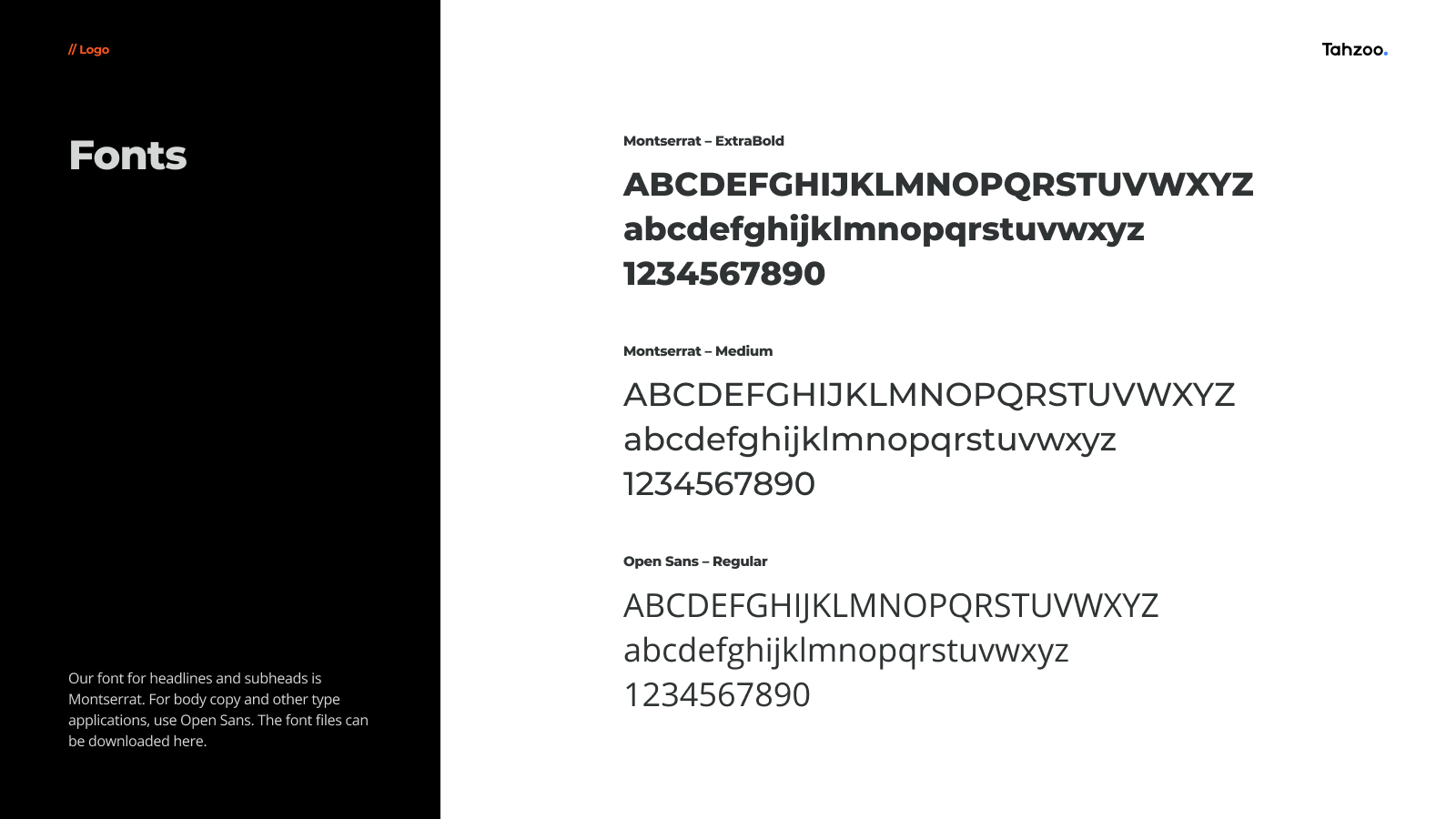
Typography choices are similarly intentional. The selection of clean, modern sans-serif fonts like Montserrat and Open Sans ensures legibility across platforms while exuding contemporary sophistication. The typography isn't just about style; its about enhancing user experience and ensuring brand consistency.
Research and Feedback Integration
Research involved a deep dive into Tahzoo's past design materials, competitor branding, and industry trends.
By analyzing what worked and what didn't, I crafted guidelines that preserved the essence of Tahzoo while setting a new standard.
By analyzing what worked and what didn't, I crafted guidelines that preserved the essence of Tahzoo while setting a new standard.
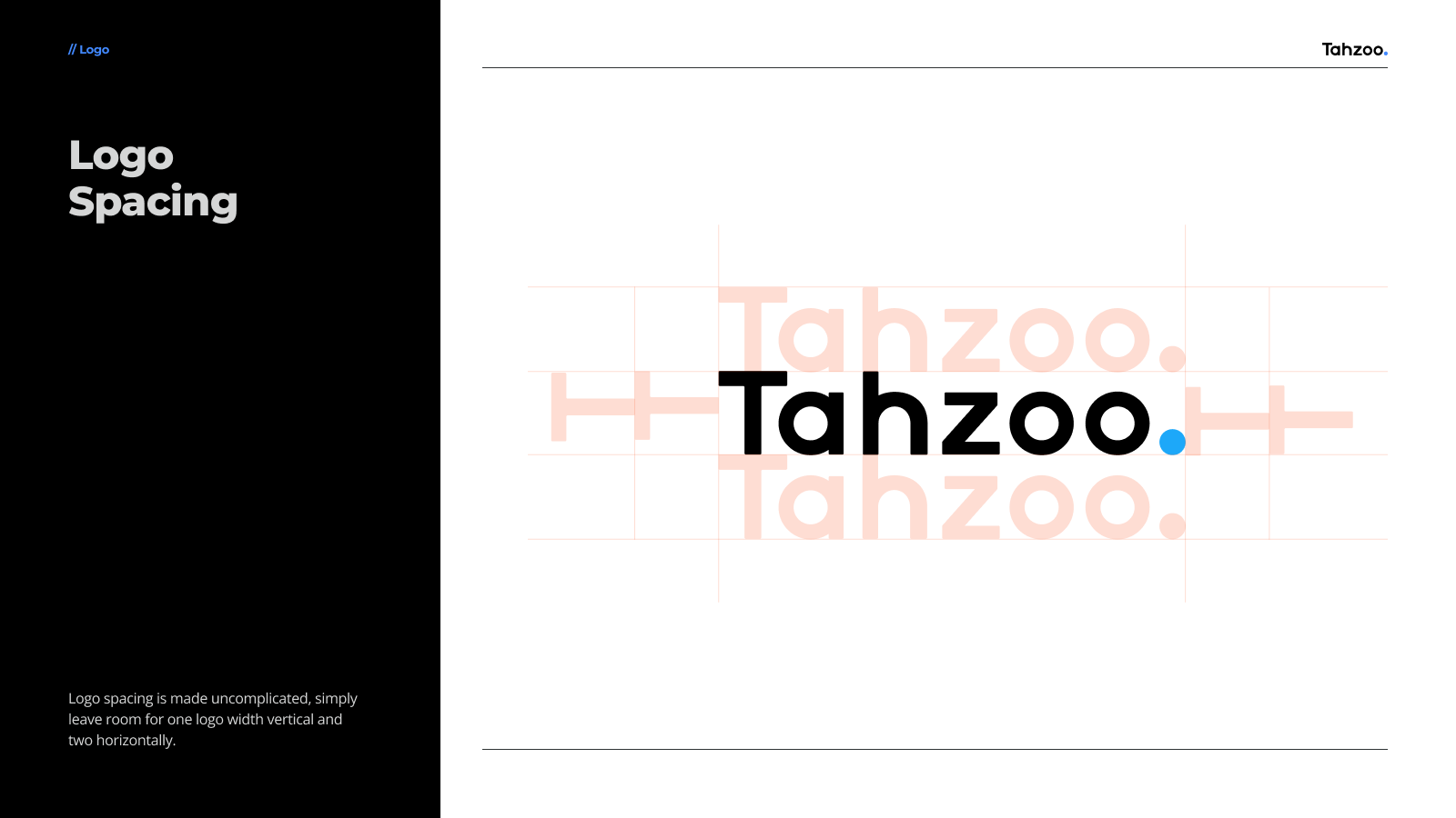
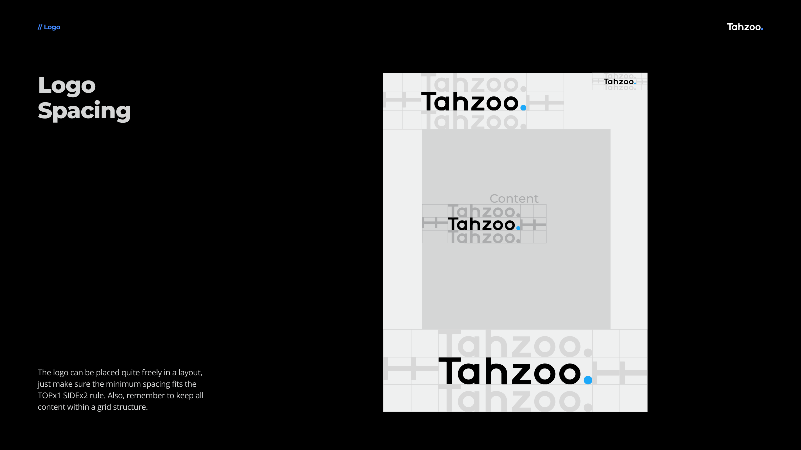
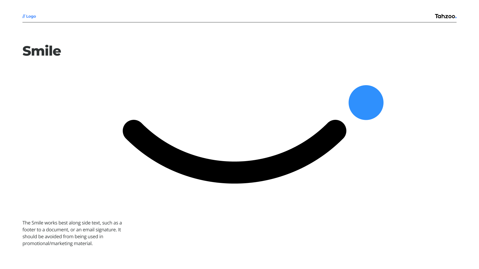
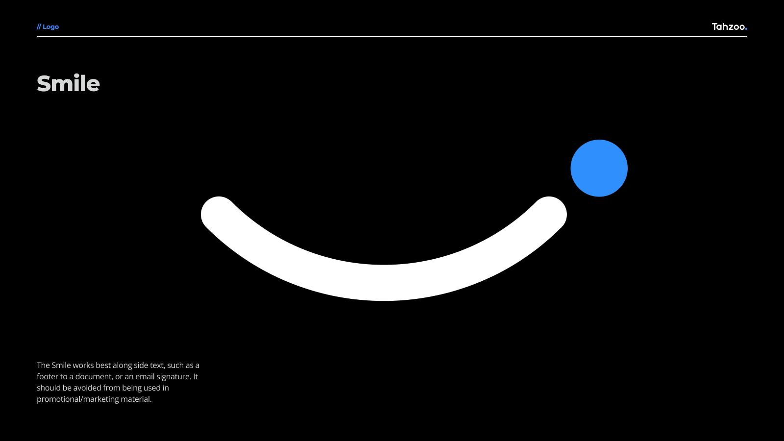
Initial drafts were shared by various stakeholders to gather insights. This collaborative approach honed the guidelines significantly. For example, the logo spacing adjustments came directly from feedback that emphasized the importance of white space in creating a visually clear and impactful brand mark.