Background.
Veer UX needed assistance in gathering Google Analytics data for their client, Lightcurve Internet. They provided me contextual data from a user survey they had conducted. Using that and data I collected from Lightcurve's GA, I came up with various insights on their audience's behavior. I then took those insights to construct two different user personas with full user journey maps for each.
Some Important Insights
Display ads attracts a lot of users but they leave immediately after arriving.
Email and referrals have highest average engagement rate, time, and events per session.
18–24-year-olds are probably on a parent’s or college plan.
High volume of Seattle users could represent people who work in Seattle, accessing
the sitefrom a work computer.
High volume of Seattle users could represent people who work in Seattle, accessing
the sitefrom a work computer.
After the home page, the email support page is the highest traffic page.
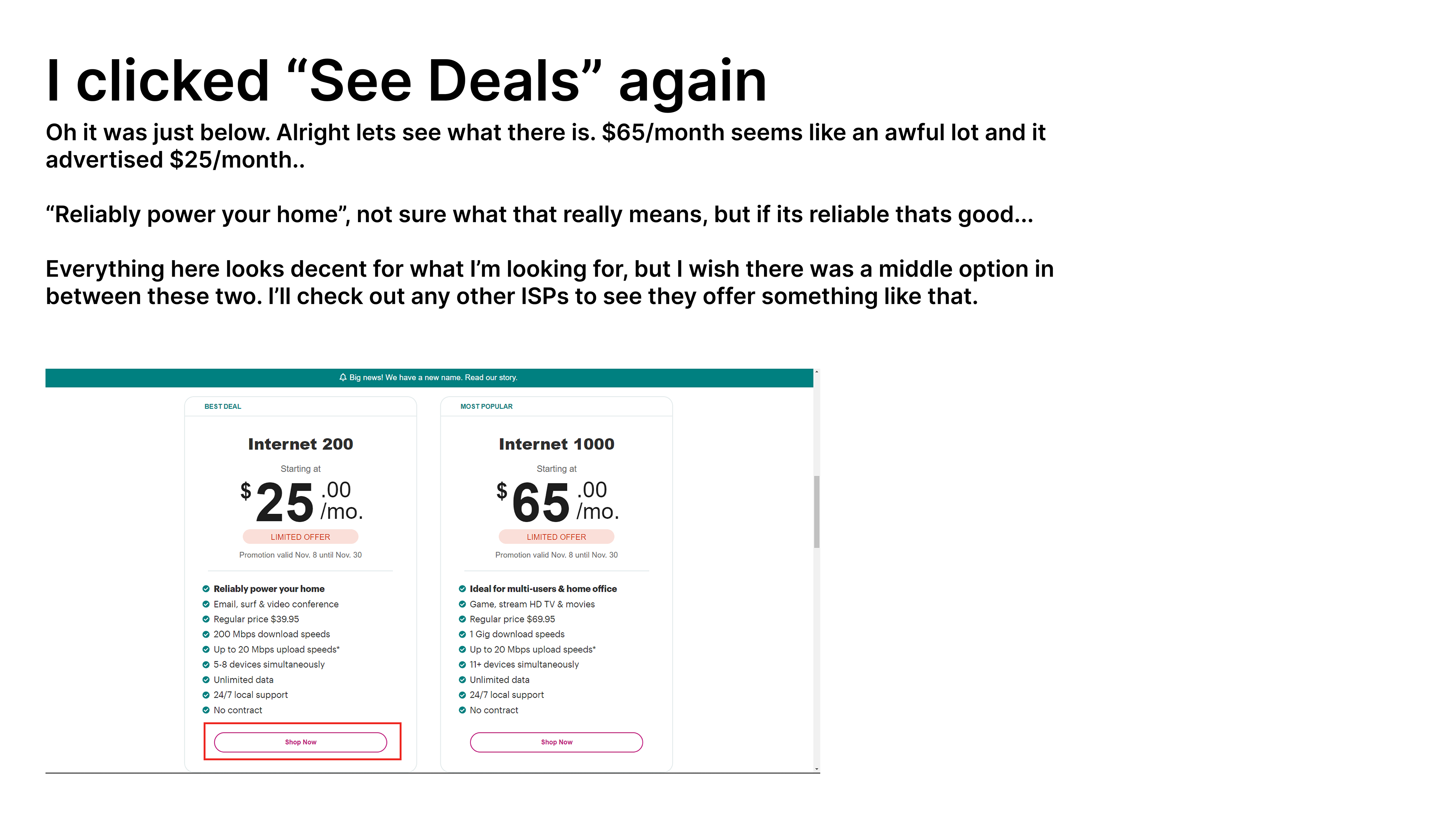
When users arrive on the shop page, they seem to stop for an extremely long time. This could be that they are taking a long time to think about purchasing, that they are looking at competitors for anything better at the last second, that they are getting up from their computer, or that they are getting lost.
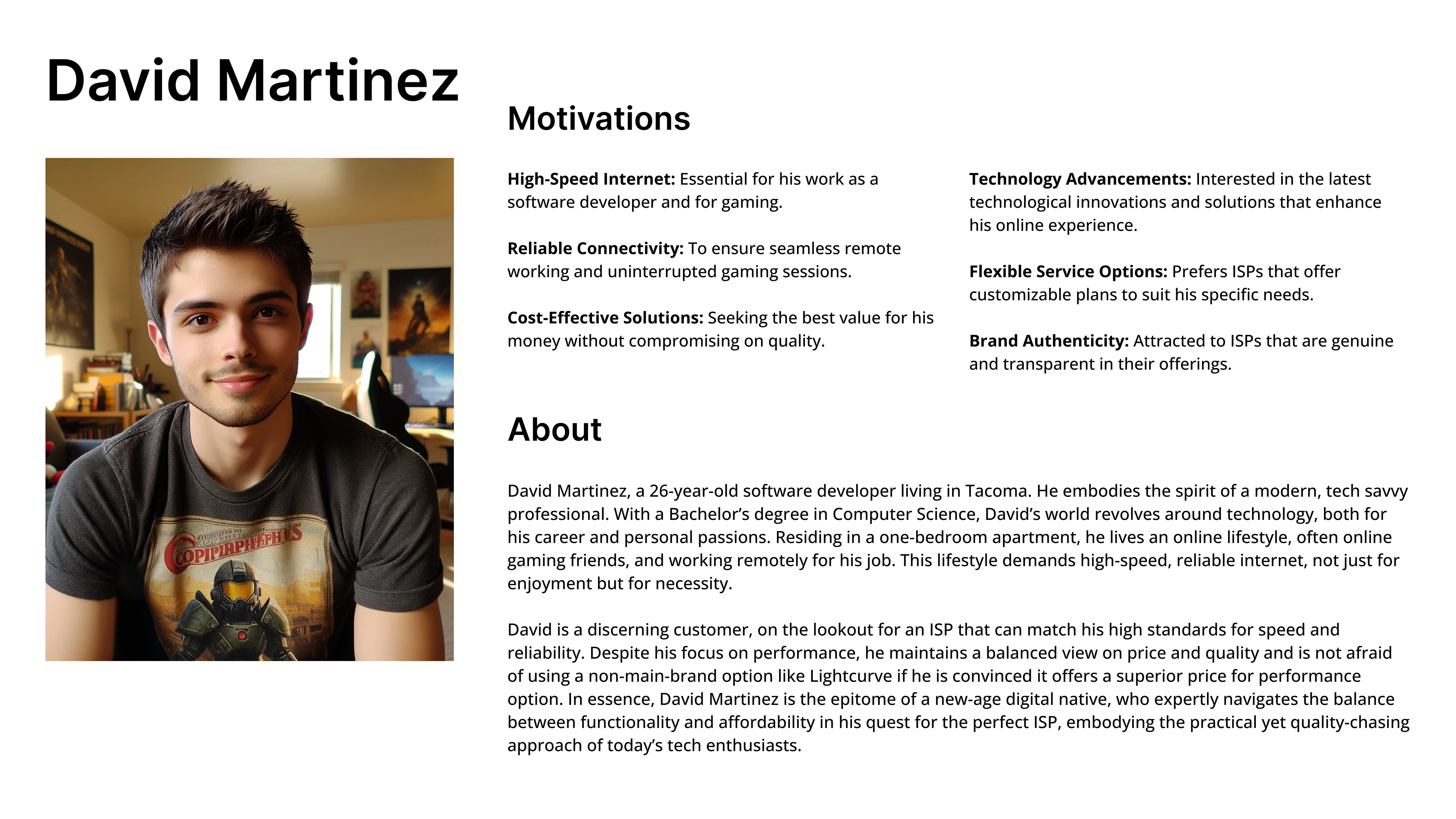
User Persona 1: David Martinez
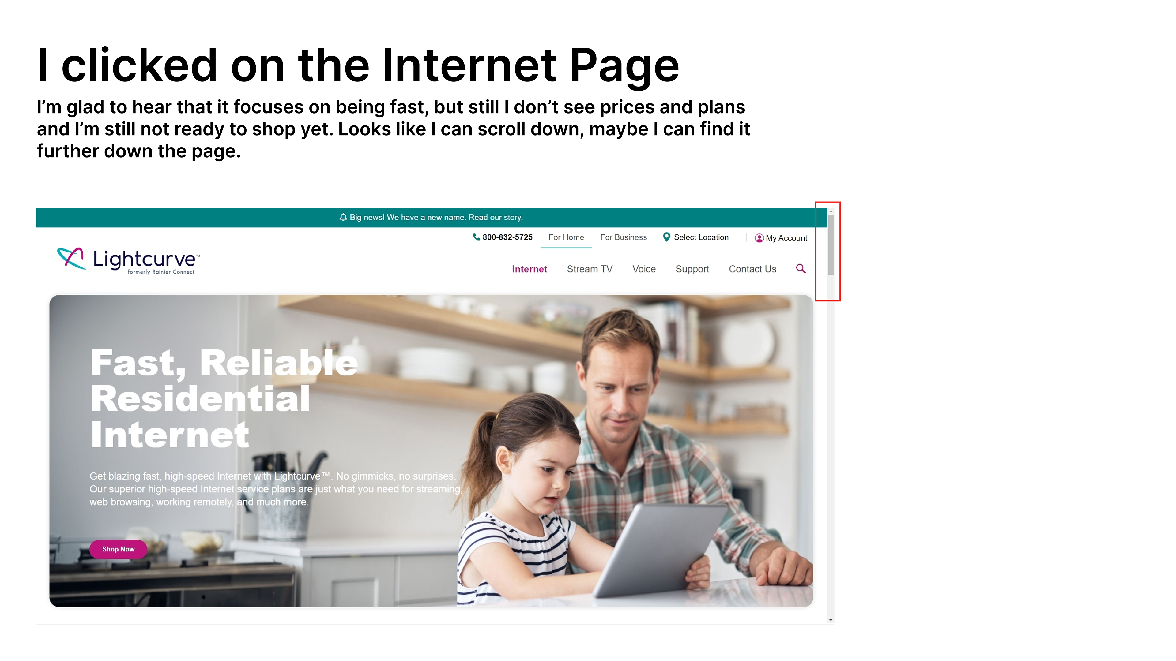
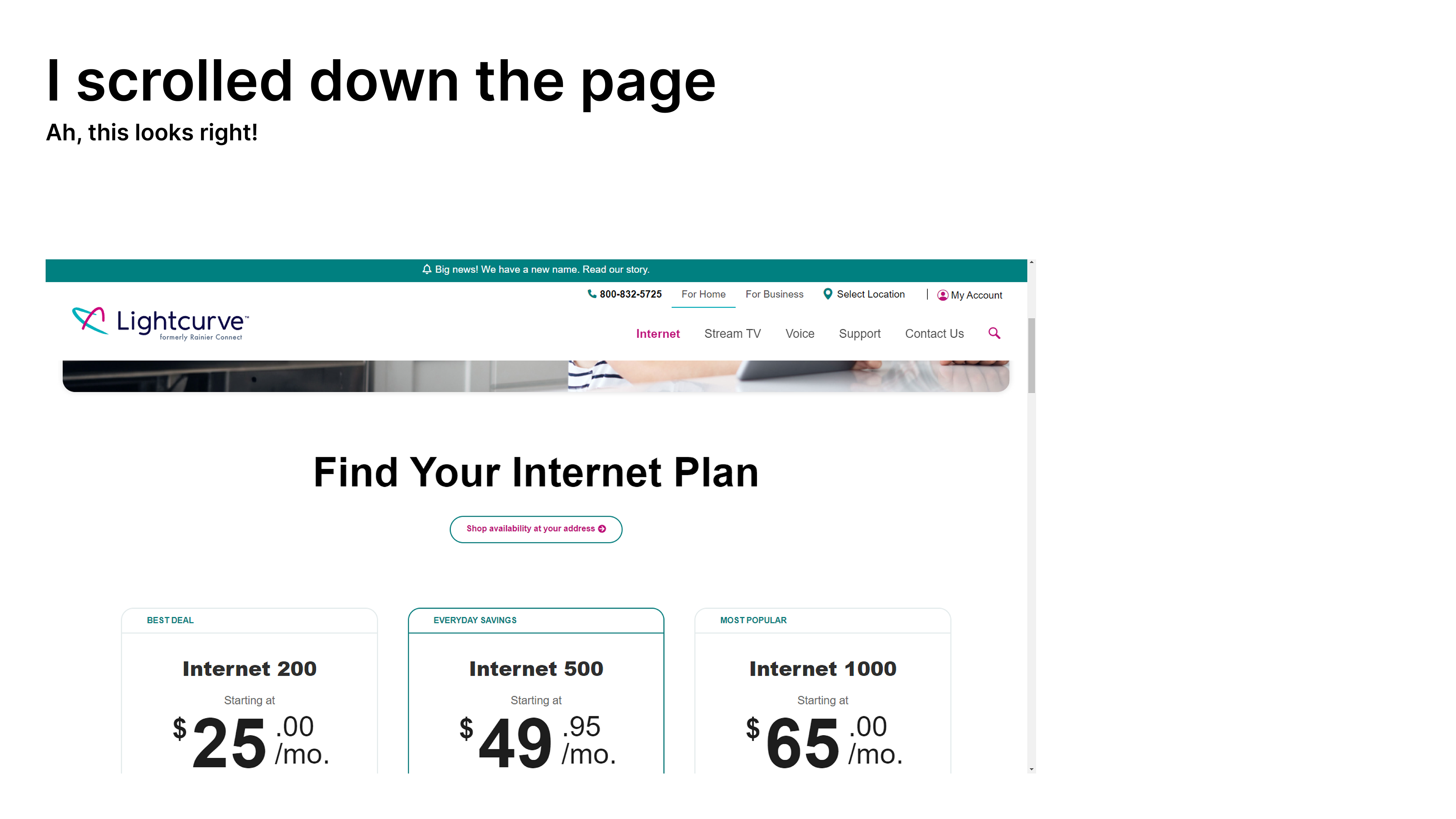
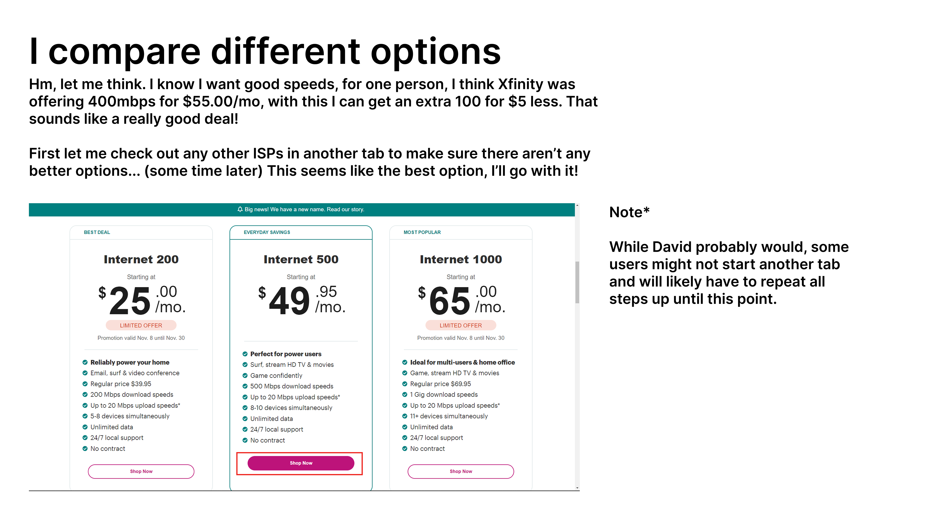
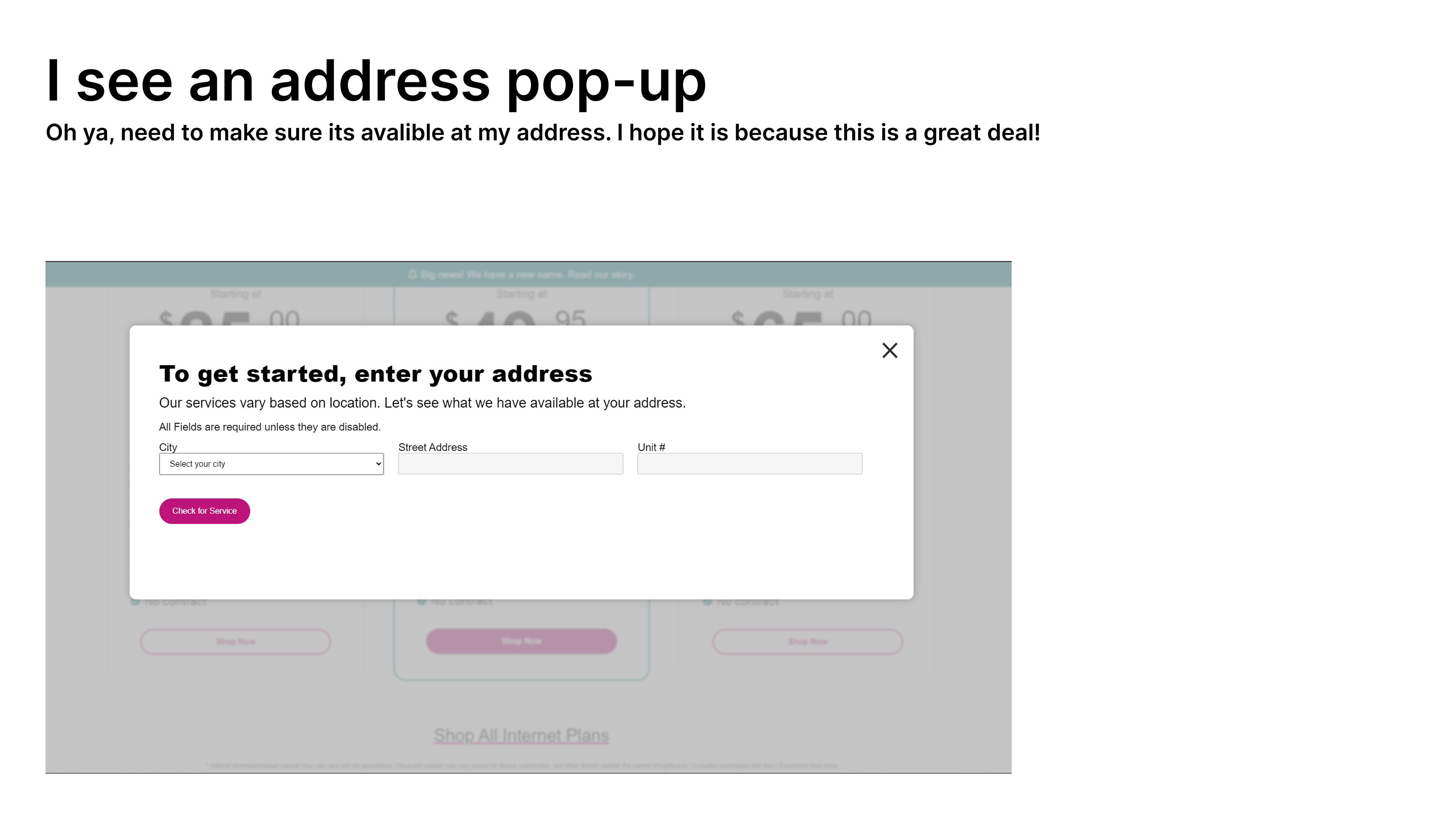
Because my demographic is found within the survey data, it became easy to build a persona around myself. This first journey map was based partially off of my own experience with looking for and purchasing an ISP plan for my home internet. He represents the 20 something remote worker who lives independently.


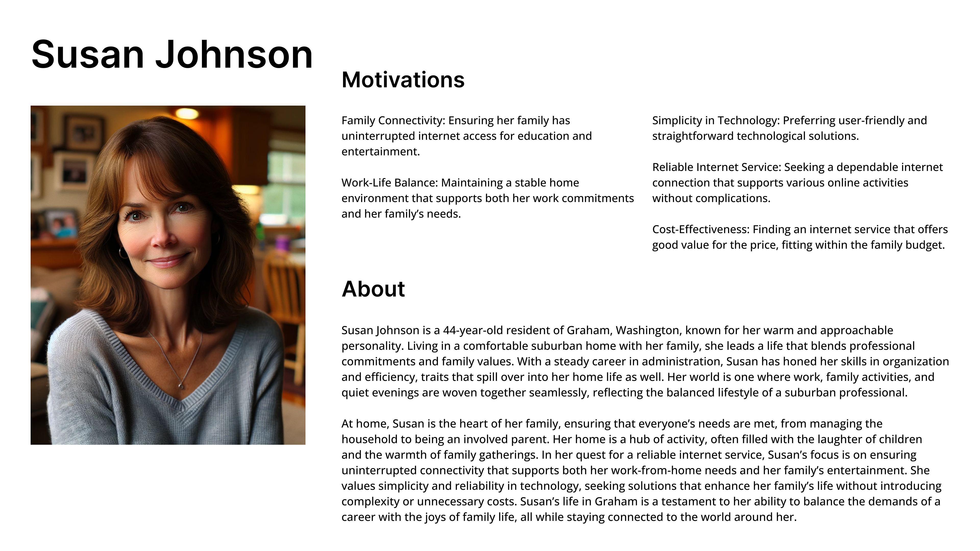
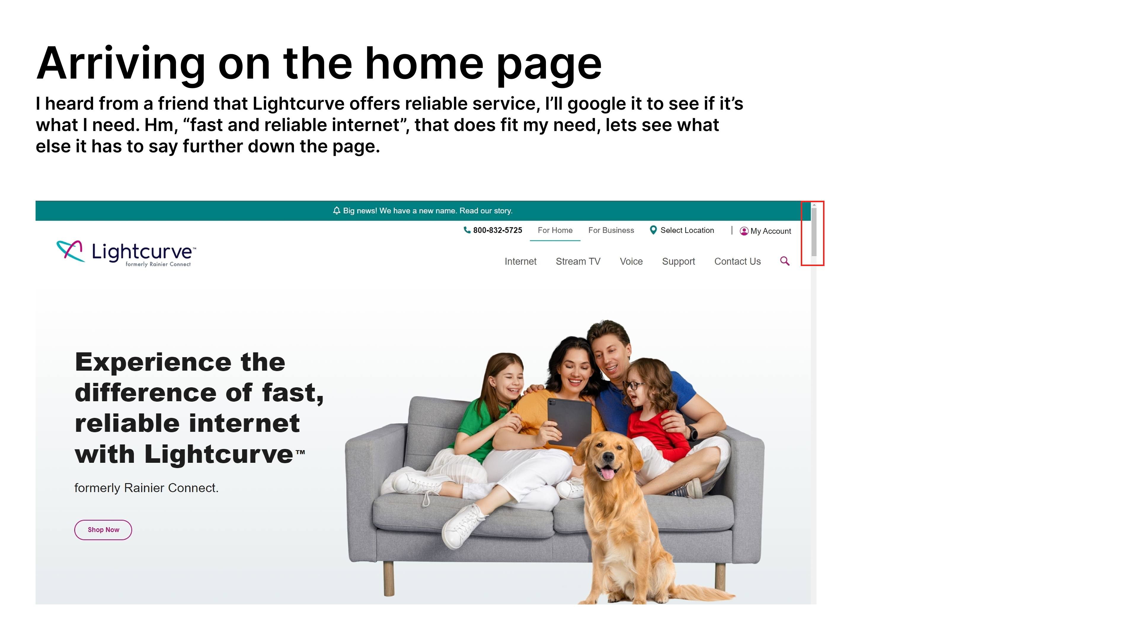
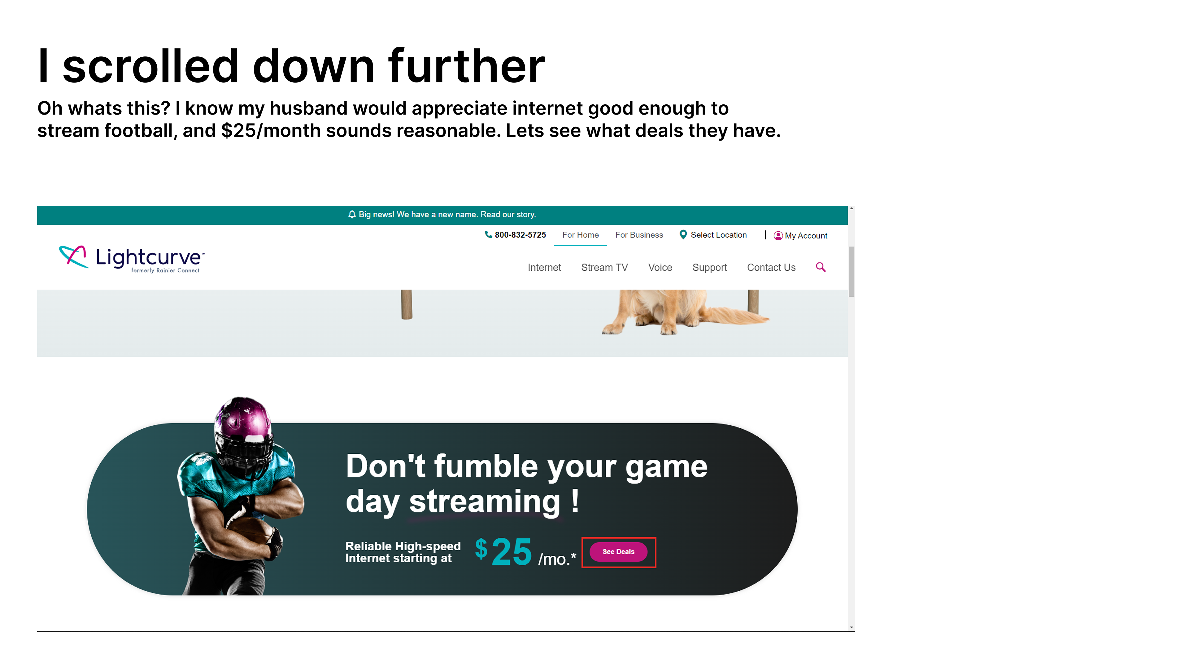
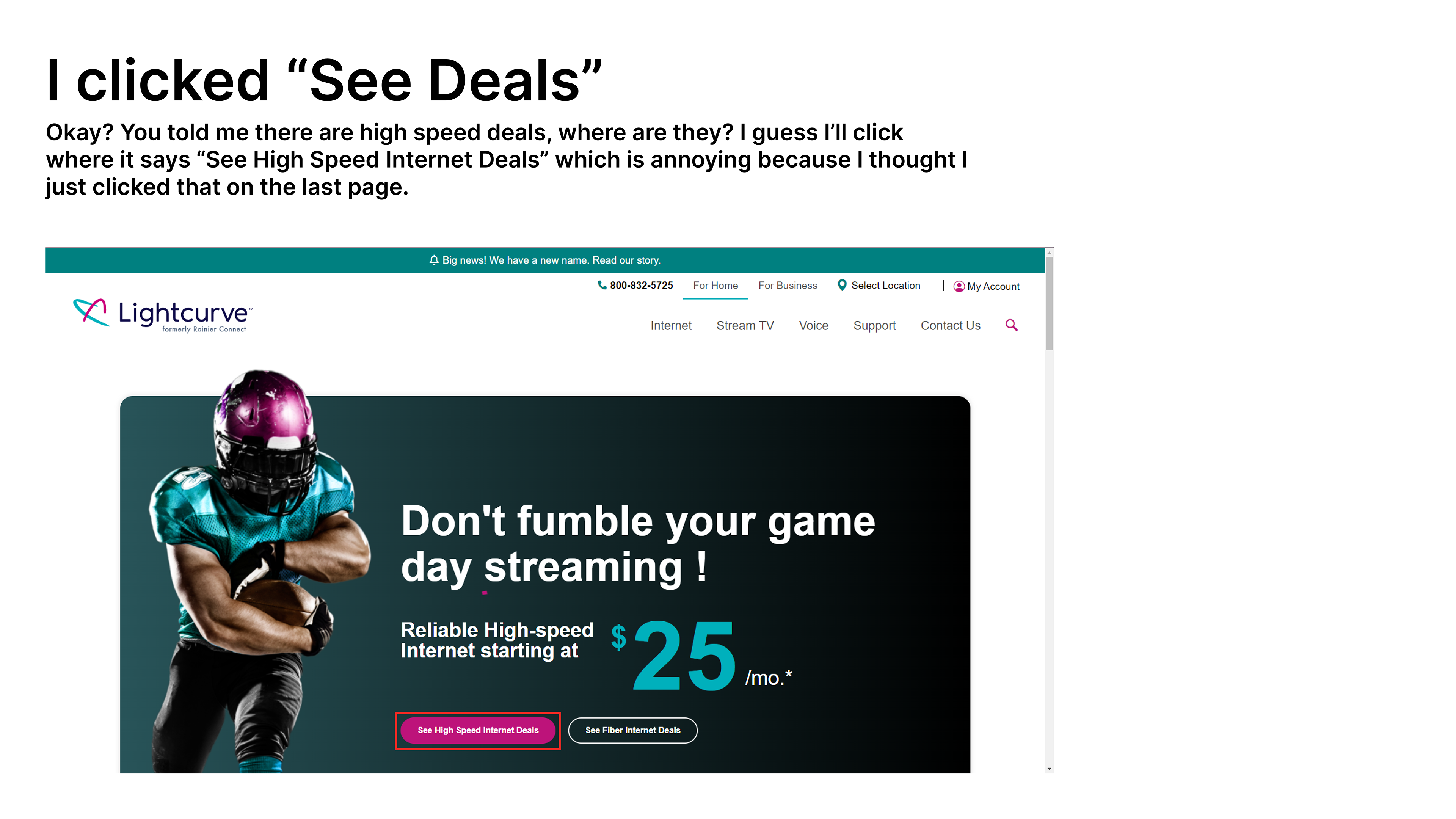
User Persona 2: Susan Johnson
This persona is instead based off the most common demographic within the survey and is a good contrast from David. She represents the middle aged mom who makes most purchasing decisions for her family.