UX Design / Art Direction / Mobile Design
Background.
Welltower, the country's largest real estate investment trust for senior living communities, needed to redesign the websites for each of their, over 500 properties. As a part of the overall redesign effort I helped develop the universal component library. Specifically I completed three tasks:
1. converting desktop components to mobile and table sizes.
2. creating and designing an icon library.
3. creating and designing a button state library.
1. converting desktop components to mobile and table sizes.
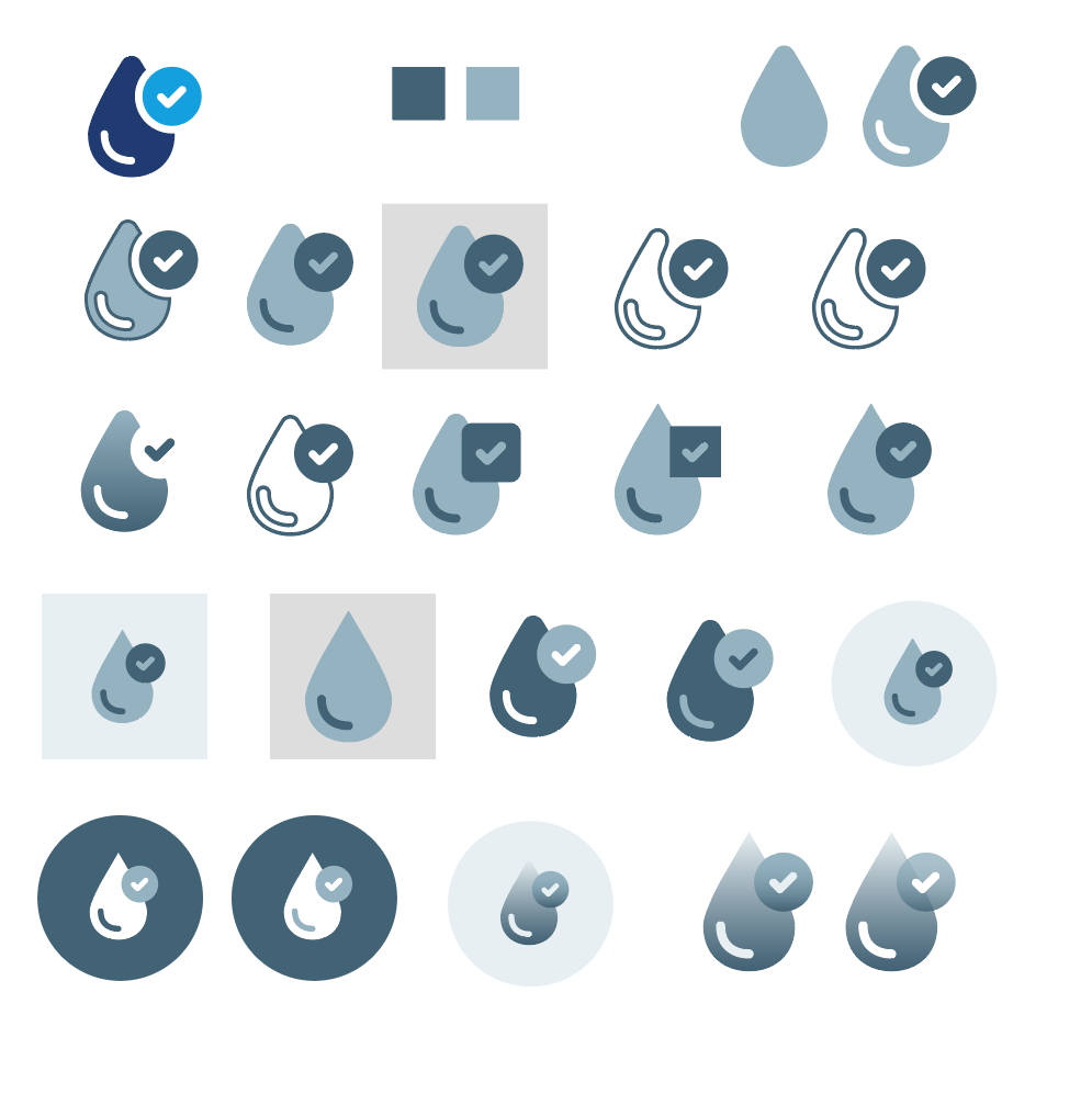
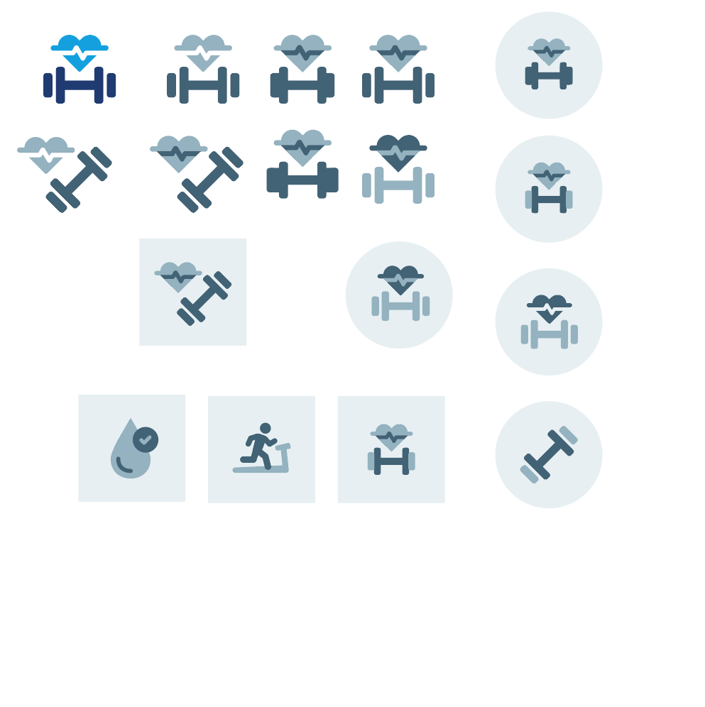
2. creating and designing an icon library.
3. creating and designing a button state library.
Task 1: Converting Desktop Components to Mobile and tablet
In today's world websites need to be accessible from different types of devices. My responsibility was to ensure desktop components were properly redesigned to fit mobile and tablet screens.
To achieve this, I looked at lots of examples of other mobile websites to see how they went about translating designs. I avoided mobile app designs because they tend to layout information quite differently than straight websites do.
The more someone has to scroll the more likely, they'd just give up and leave, so I reworked many of the components to take up less vertical room by shrinking images and utilizing the carrousel component to allow for horizontal swiping.
Task 2: Designing icon assets
Faced with the high cost of custom photography, I built an icon library that could be used in the place of images.
I was tasked with designing these icons. Since it was not in the SOW to build entirely new icons, I searched for stock sets that closely matched the Monarch style, then edited them further to fully integrate them into the brand. I found various different sets then narrowed them down to one which I used to build our new icons.

Task 3: Creating Button States
The audience was made up of seniors and their adult children looking for a senior living community. For this audience it was important that the colors would be clear and readable. I adjusted the colors until they passed the contrast readability test on WebAIM.com.
Additionally, I made all hover and click states uniform to maintain consistency, so it would always be clear
whena button was clicked no matter what its active state looks like or what background its on.
Additionally, I made all hover and click states uniform to maintain consistency, so it would always be clear
whena button was clicked no matter what its active state looks like or what background its on.
