Problem
Through user research, I discovered that students using Zoom for remote classes would often show up late to meetings. The main way they’d enter the call was by franticly pulling up the meeting link on a separate platform, such as Canvas. It is already possible to set up recurring meetings on Zoom, however none of the students I interviewed were aware of this feature.
Solution
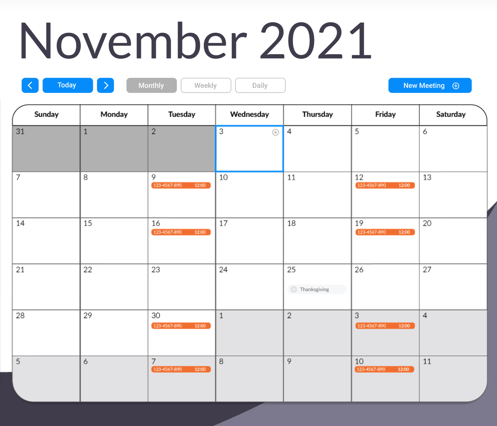
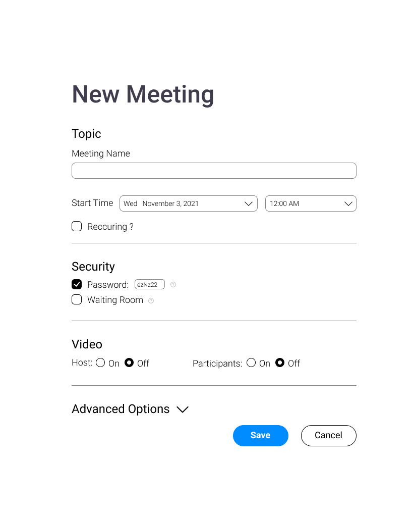
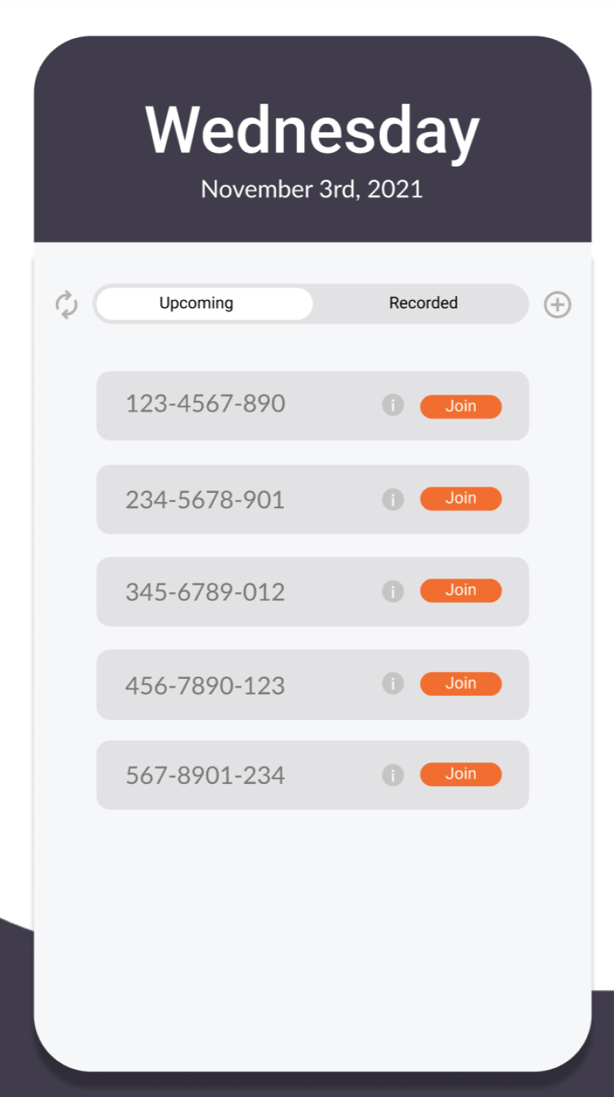
I designed a new in-app calendar system with intuitive meeting setup and management controls, and added it to the main nav bar to more prominently showcase its presence. This helped casual users quickly notice and understand the feature so they would no longer need to take the more complicated and redundant, link based, path to joining a meeting every time.
Calendar Page
Research.
Before having any idea of what Zoom’s problems or solutions could be, I began by researching various statistics about Zoom, its user base, its history, and any other helpful information I could find. This information didn’t tell me much about what people thought of Zoom, but what it did show was some important quantitative data on the types of people using it. Next I was able to narrow my focus down to certain groups which helped me later on developing user personas.
KEY USER RESEARCH FINDINGS
Education makes up 6% of Zoom’s usage.
(Enlyft, 2021)
The United States has 53% of Zoom’s users.
(Enlyft, 2021)
Zoom’s users are made up of roughly 50/50 men vs women.
(SimilarWeb, 2020)
Personas
Since I found out from my research that a large segment of Zoom’s user base were students, a group I personally identify as, this is the specific group I decided to focus in on when searching for pain points. Here is one of a few user personas I created. At first they remained fairly basic without goals or pain points, however they provided an even clearer picture of what kinds of people I would go onto interview. After conducting several interviews I took these insights I had gathered and fleshed out the personas further.
NAME Emily Baker
AGE 22
CAREER Biology Student
AGE 22
CAREER Biology Student
BACKGROUND
Emily is a third year student majoring in biology at a large university. She is taking all of her classes online due to the COVID-19 pandemic. She lives in a small apartment with her best friend. Being someone diagnosed with ADHD, she is often forgetful and smuggles with organizing her school work week.
Emily is a third year student majoring in biology at a large university. She is taking all of her classes online due to the COVID-19 pandemic. She lives in a small apartment with her best friend. Being someone diagnosed with ADHD, she is often forgetful and smuggles with organizing her school work week.
GOALS
Participate actively in class discussions and group projects. Take effective notes during lectures. Be able to hear important announcements her professors may make during class.
Participate actively in class discussions and group projects. Take effective notes during lectures. Be able to hear important announcements her professors may make during class.
CHALLENGES
Struggle to find the correct meeting link for each class. Frustration with complex features on Zoom. Difficulty mental mapping schedule when all classes are online.
Struggle to find the correct meeting link for each class. Frustration with complex features on Zoom. Difficulty mental mapping schedule when all classes are online.
Insights
From the interviews I conducted, there were several different insights I gathered. All of the interviewees had some negative perception of Zoom, some of them had issue with the social experience compared with in person meetings, others had more technical problems such as the audio systems being unintuitive.
Of all of these interviews however, there was one significant issue that everyone had in common, which was the stress they felt when trying to join a class meeting. Each of their professors had a different zoom link and it was always posted in different places, forcing the user to memorize where to look for the link. Because this was a common overlapping issue for each of my interviewees, it became the main problem that I choose to tackle.
Upon further analyzing the Zoom desktop app, I found that it already had a solution to this issue, that being the Outlook link feature. The problem with this however was that neither me, nor any of my interviewees had any idea that this feature existed as it was buried under menus and forced you to link Zoom with an external calendar app. The solution going forward became to build an in app calendar system that allows users to set up recurring meetings, and to elevate it’s presence to be more noticeable to Zoom’s users.
DESIGN PROCESS.
Before having any idea of what Zoom’s problems or solutions could be, I began by researching various statistics about Zoom, its user base, its history, and any other helpful information I could find. This information didn’t tell me much about what people thought of Zoom, but what it did show was some important quantitative data on the types of people using it. Next I was able to narrow my focus down to certain groups which helped me later on developing user personas.
Calendar Wireframe
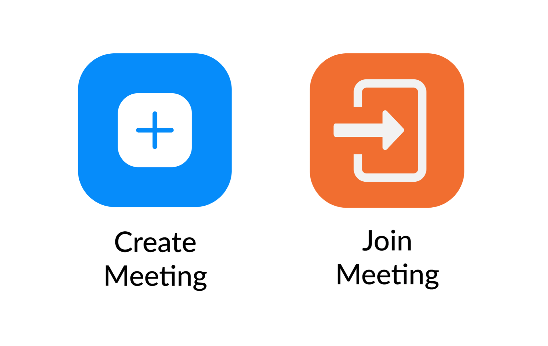
Homepage Wireframe
In order to make the calendar more visible, I also updated the home page slightly by replacing the “schedule meeting” button with the calendar. Although this added an extra step to scheduling a meeting, the user research pointed to calendar being the more important feature, also because the scheduling feature is now simplified specifically by the calendar functionality. Users can now just click a date and set up a meeting instead of having to manually type it in a pop up window.
Prototype
After making several lofi prototypes and iteratively having them user tested by the same people I had interviewed, I had refined the design of the calendar to be as intuitive to use as possible. I also further streamlined the homepage which was still causing some confusion, specifically how it showed an option to screen share even if the user was not in a call. Lastly I made some minor aesthetic changes to the navigation bar to better emphasize its pages, which now included the calendar, as well as change the color of the “Enter Call” button to orange, which I used app-wide as the signature color for paths that lead directly to a call.
Full Prototype
