Product Design / UX Design / User Research / UI / Heuristic Analysis
Background.
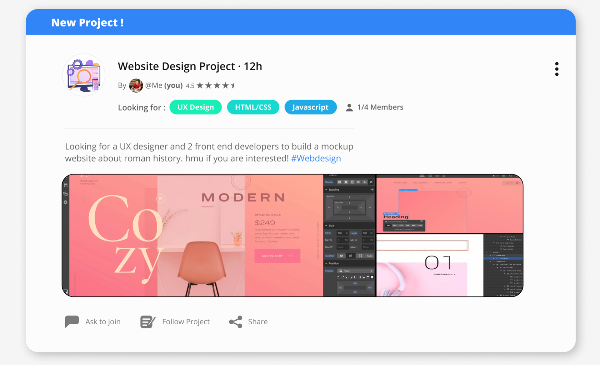
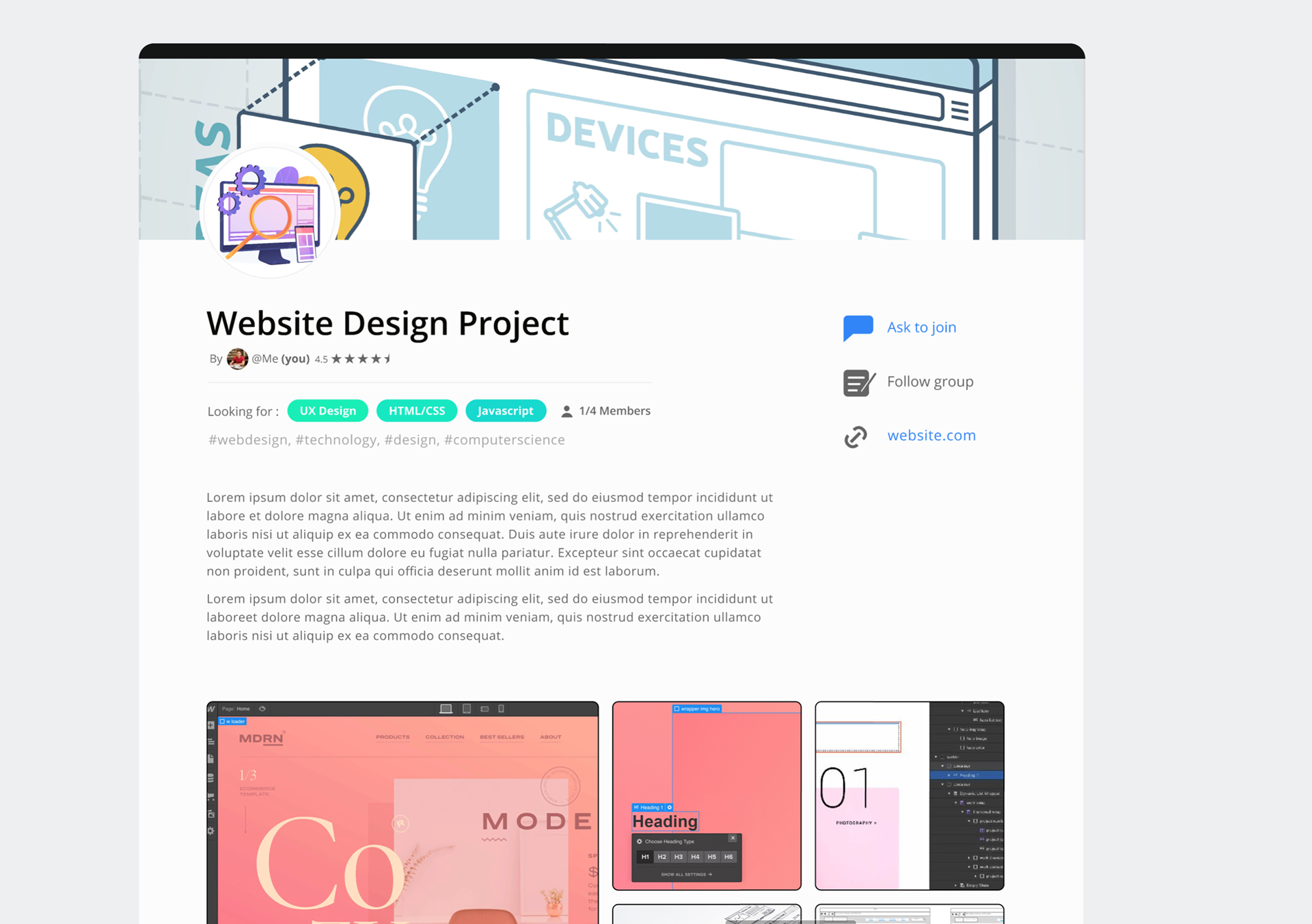
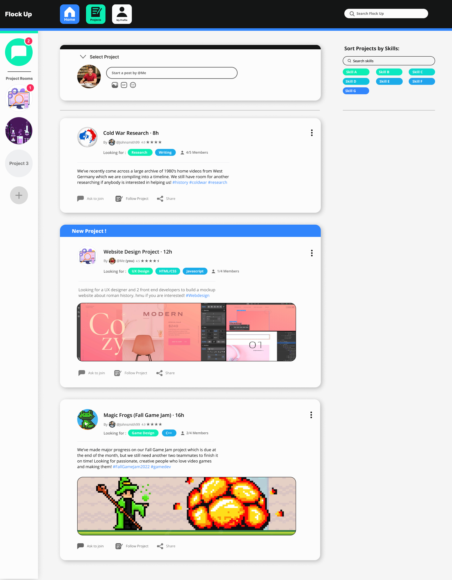
Flock Up is a digital application that was developed to provide the means for young professionals to match themselves with the right team that will work together and deliver the best results for a particular project. Users can advertise for prospective teammates with the right skill sets and temperament to join their team. Or they can request to join someone else’s team that they find interesting by directly contacting the team creator.
Additionally, Flock Up provides a Discord/Slack style group chat room to allow teams to self-organize and communicate effectively without the need to leave the platform. Additionally, each team member is able to leave reviews on the profiles of other teammates that they’ve worked with, rate their abilities and performance and indicate their level of mutual satisfaction.
Additionally, Flock Up provides a Discord/Slack style group chat room to allow teams to self-organize and communicate effectively without the need to leave the platform. Additionally, each team member is able to leave reviews on the profiles of other teammates that they’ve worked with, rate their abilities and performance and indicate their level of mutual satisfaction.
Forming The Vision
The idea of making it easier for teams to self-organize and find the right teammates grew from friends and colleagues who had negative experiences when working in teams. We all believed that there had to be a better way to match people with like-minded highly committed individuals, dedicated to producing the best outcomes. From this common understanding of the problem, we conceived of an app that could give more
insight and considerations when assembling the right mix of people to form the best team for any given project.
insight and considerations when assembling the right mix of people to form the best team for any given project.
Defining the Opportunity
Recent graduates in both the computer science and Design/UX fields are facing the task of entering highly competitive industries. One of the biggest challenges is that many employers are looking for candidates that have already proven themselves, even for entry level positions.
This creates a “chicken or the egg” situation where experience is needed to gain experience. Internships have traditionally offered a solution, however given the current economic environment, most internships require an existing portfolio just to get the chance to gain some experience. Consequently, many graduating students have not had the opportunity to build their portfolios that showcase their skills through participation in multiple and multi-disciplinary projects.
As we developed the Flock Up concept, we realized that the tool could help solve the chicken or egg conundrum that was adding stress and anxiety to our lives, just as we are leaving the university cocoon and preparing to enter the real world of our chosen fields.
The Chicken or the Egg Statistic
Research.
Even though the team represented the intended audience, to adhere to good research principles, I solicited and conducted a series of interviews with students outside our group who were experiencing
the same challenges.
the same challenges.
These independent perspectives provided additional insights and guided me to make more informed design choices. For example, I, as a user, only really cared if the project team could get its work done on time. Whereas other interviewees, valued team communication above all else.
The insight gained from balancing these perspectives led to the design and implementation of a group chat feature, modeled on Discord’s design, which most of the people interviewed were familiar with and found easy to use, with virtually no learning curve.
Examples of insights gained from the user research
and the solutions they informed included –
and the solutions they informed included –
Insight
The biggest factor leading to negative group project experiences was from having unmotivated or simply
poor communicating group members drag down the rest of the team by not effectively contributing.
poor communicating group members drag down the rest of the team by not effectively contributing.
Solution
The implementation of the teammate review feature allowed members to make
more informed decisions about who to invite to join the team.
more informed decisions about who to invite to join the team.
Insight
Most users prefer everyone in a group to work on tasks separately rather than all
work together on one task at a time.
work together on one task at a time.
Solution
Flock Up allowed users to sort by and equip specific skill tags that represented their strengths, simplifying the selection of a diverse set of abilities, while still allowing users to join with other similarly skilled individuals
if they choose to.
if they choose to.
Imagining the User Journey
Having reached a consensus about the vision and purpose of the Flock Up app, I laid out the two primary use cases which would each inform their own user journeys. The first use case was centered around finding people to join my team for a particular project. Whereas in the second use case, the user wanted to join someone else’s team and project. While both scenarios contained essentially the same functionality, they represent very different user perspectives and goals.
Skill Tags
Design process.
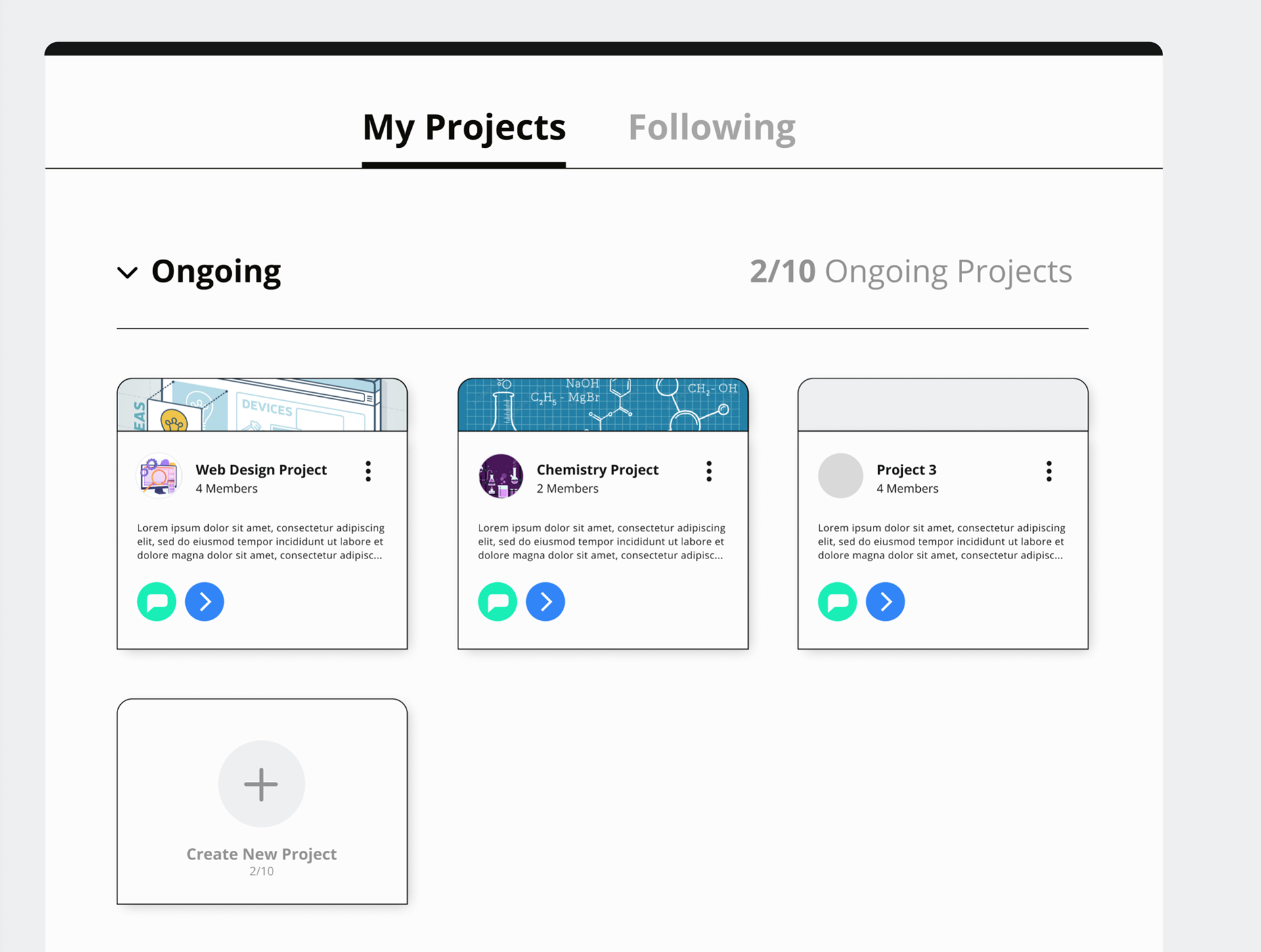
Once we had defined the use cases and the envisioned what the user flow would be like in both scenarios, based on research and interviews, I was able to lay out wireframes to visualize all the pages and their requisite components needed to build the prototype. Here are a few of them –
Home Page
Group chat
Profile
Home Page
Heuristic Analysis.
One of the victims of our timeline was our ability to conduct full user testing on the prototype. As a quicker alternative, I performed a heuristic analysis of the prototype, using Jakob Nielsen’s 10 general principles for interaction design as my guide post while developing the prototype. This solution allowed me to keep the development workstream on a user centered path even given the limited time and resources and to meet our deadline. Here are some examples of solutions that came out of the analysis –
Two Axis Nav Bar
The two main features of Flock Up, the group matchmaking and the group chat rooms were broken up into two separate navigations, both persistent regardless of which page the user is on. The chatroom system was specifically designed on a vertical access in order to feel familiar and recognizable to users who have used either Discord or Slack with each chat room represented with its own icon. This approach matched the system with the real world experience of the users.
Once a user sends a join request and writes an introductory message, a pop up appears, pointing to where to look for a response. This provides the user with immediate feedback, confirming that their request was successfully submitted and guiding them to the next stage.
Confirmation Messages
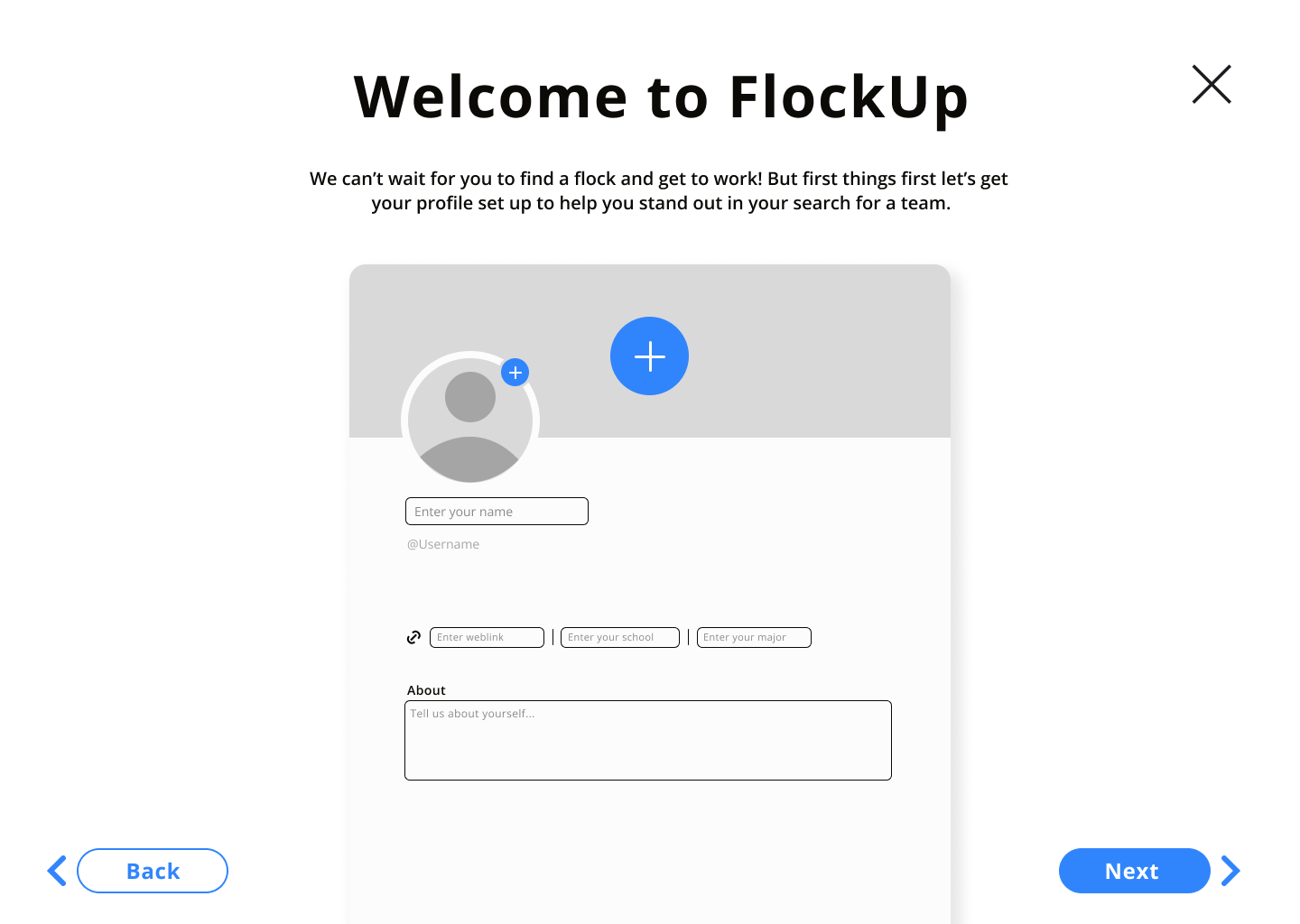
When users are setting up their profiles, they are given the option to pick skill tags to add to their profiles. However to give the user a sense of freedom and control over the process, they have been given the ability to simply escape the set up process by hitting the “X” icon. At that point, they can jump straight into the site and set up their skills later.
