Background.
For my college UX design project, I redesigned the website for Cityfruit.org, a non-profit organization promoting urban fruit cultivation. The goal was to improve the website's functionality, aesthetics, and user experience. Through research, prototyping, and testing, I created a design that met user needs while aligning with the organization's mission and values.
Figuring it Out: What is City Fruit?
I began by researching everything about the NGO, what it does, its history, how they communicate with their audience, etc, from their website and social media. From the research, I figured out the specific purpose of their website, beyond simply informing people about them
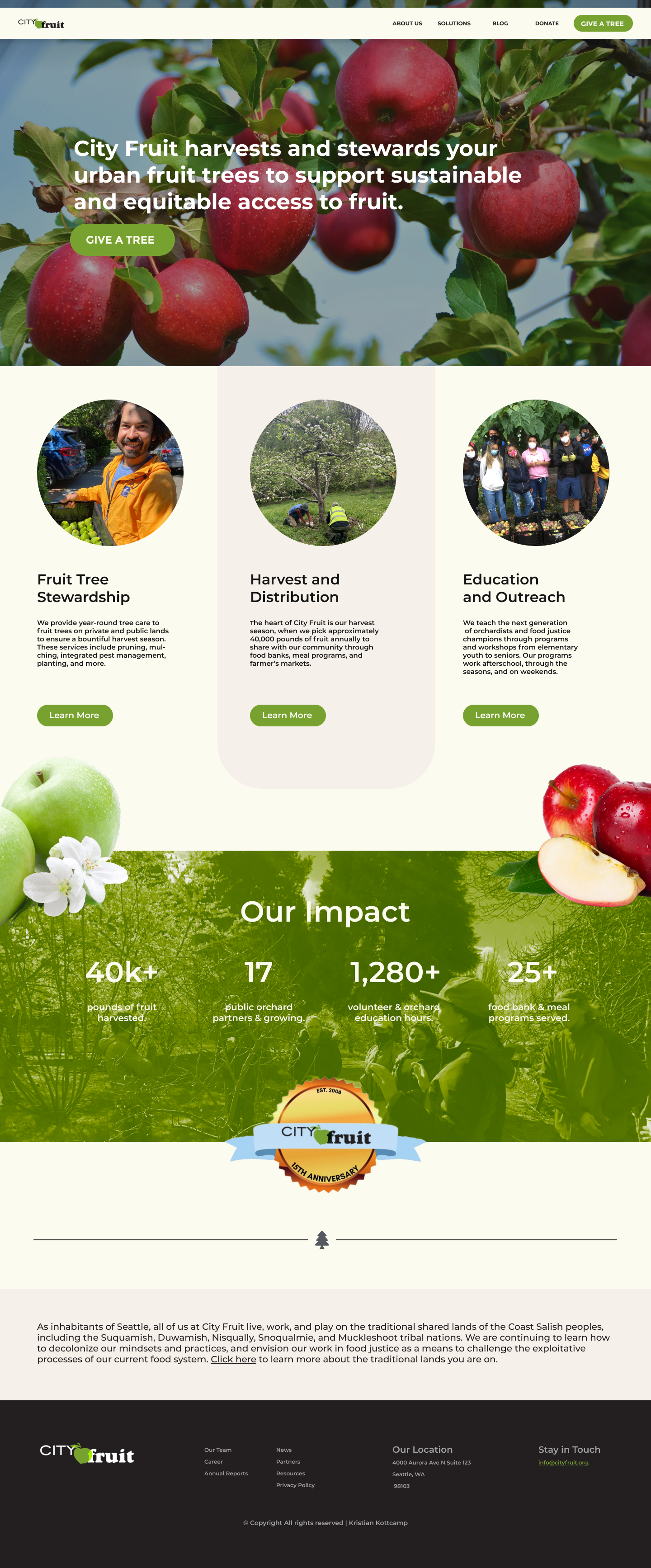
The core mission of City Fruit is to harvest fruit from peoples’ unused fruit trees in urban areas to give to foodbanks.
The core purpose of the website is to convince and guide property owners to sign up to have their trees harvested.
I conducted a usability test on the current website to see how well it achieves the purpose is and identified the pain points that interrupt the achievement of the goal.
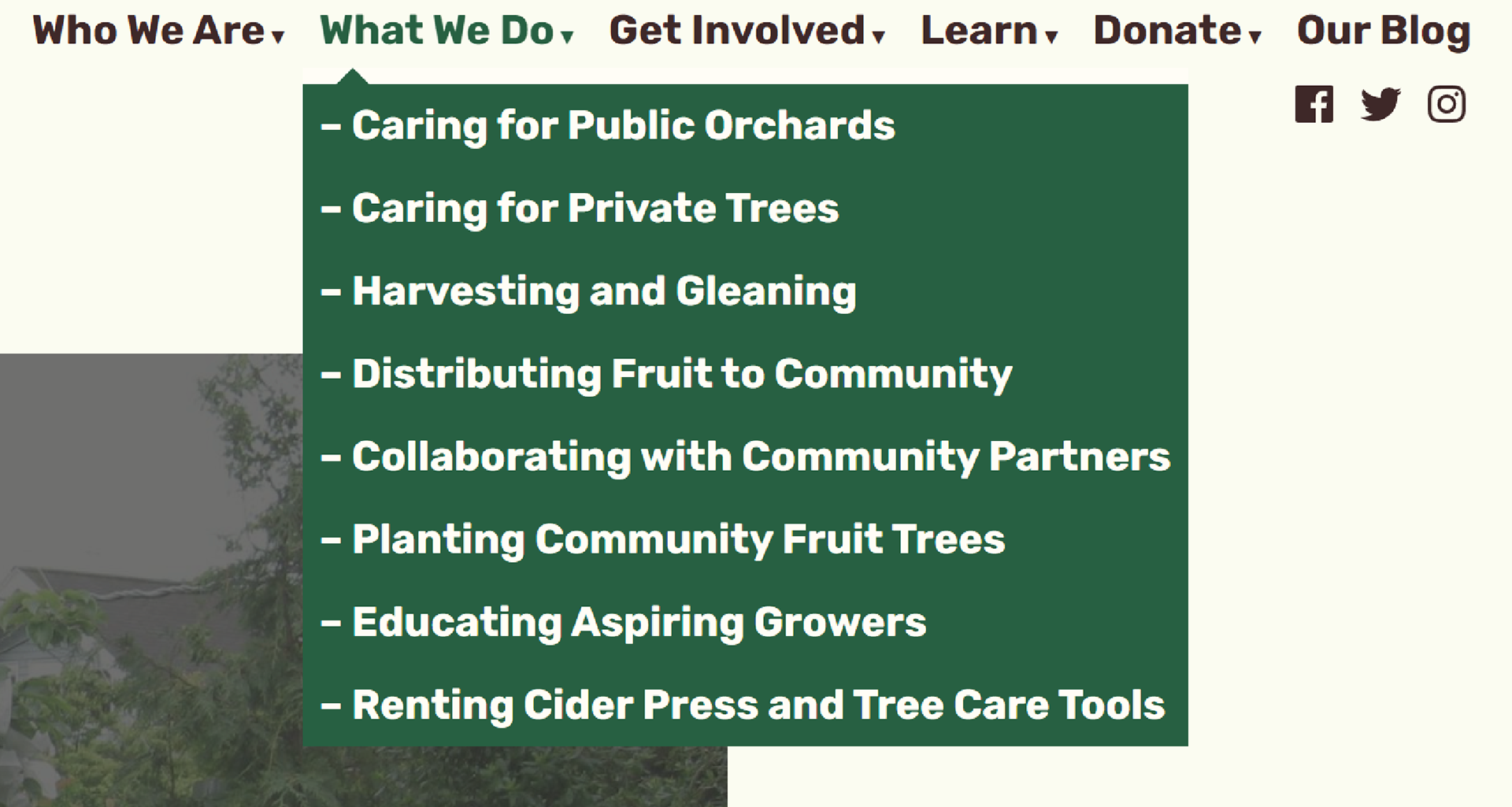
The key findings of the usability test are their navbar is way too crowded, making it difficult to find specific information.
The aesthetic, “ugliness” of the website subtracts from organization’s reputability/trust.
The ability to sign up for tree harvesting is buried behind multiple menus and carousel, reducing the likelihood of signing up.
The core purpose of the website is to convince and guide property owners to sign up to have their trees harvested.
I conducted a usability test on the current website to see how well it achieves the purpose is and identified the pain points that interrupt the achievement of the goal.
The key findings of the usability test are their navbar is way too crowded, making it difficult to find specific information.
The aesthetic, “ugliness” of the website subtracts from organization’s reputability/trust.
The ability to sign up for tree harvesting is buried behind multiple menus and carousel, reducing the likelihood of signing up.
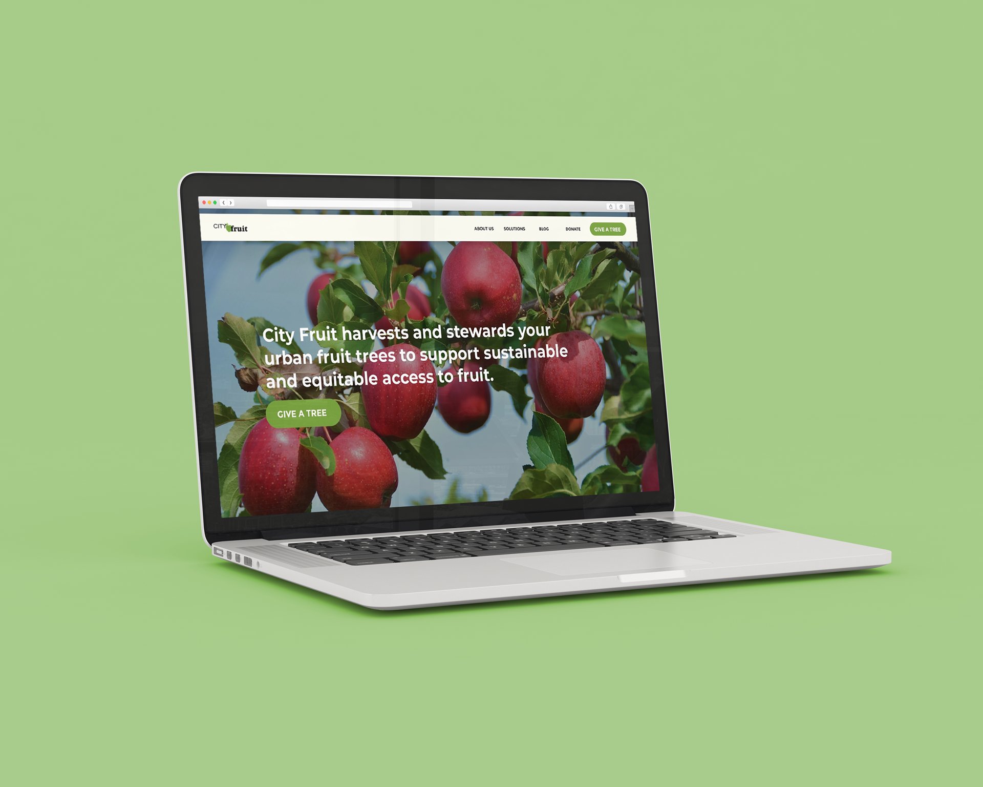
Old Website

The Plan.
THE OBJECTIVE
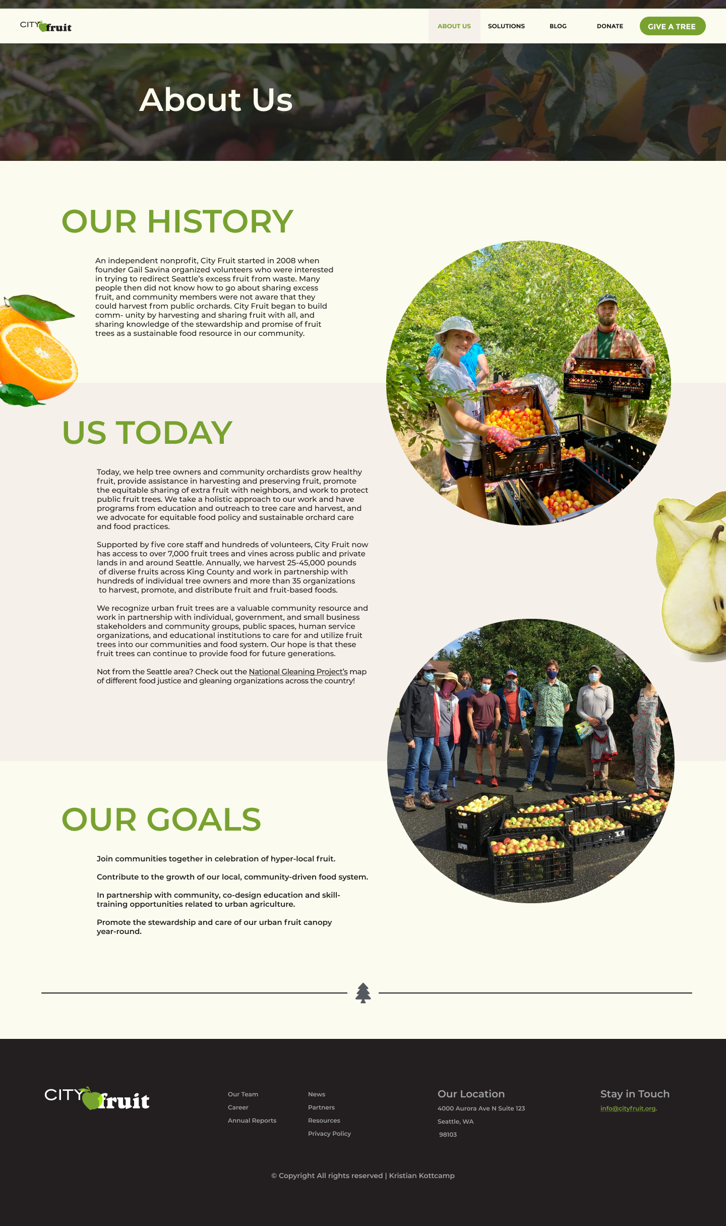
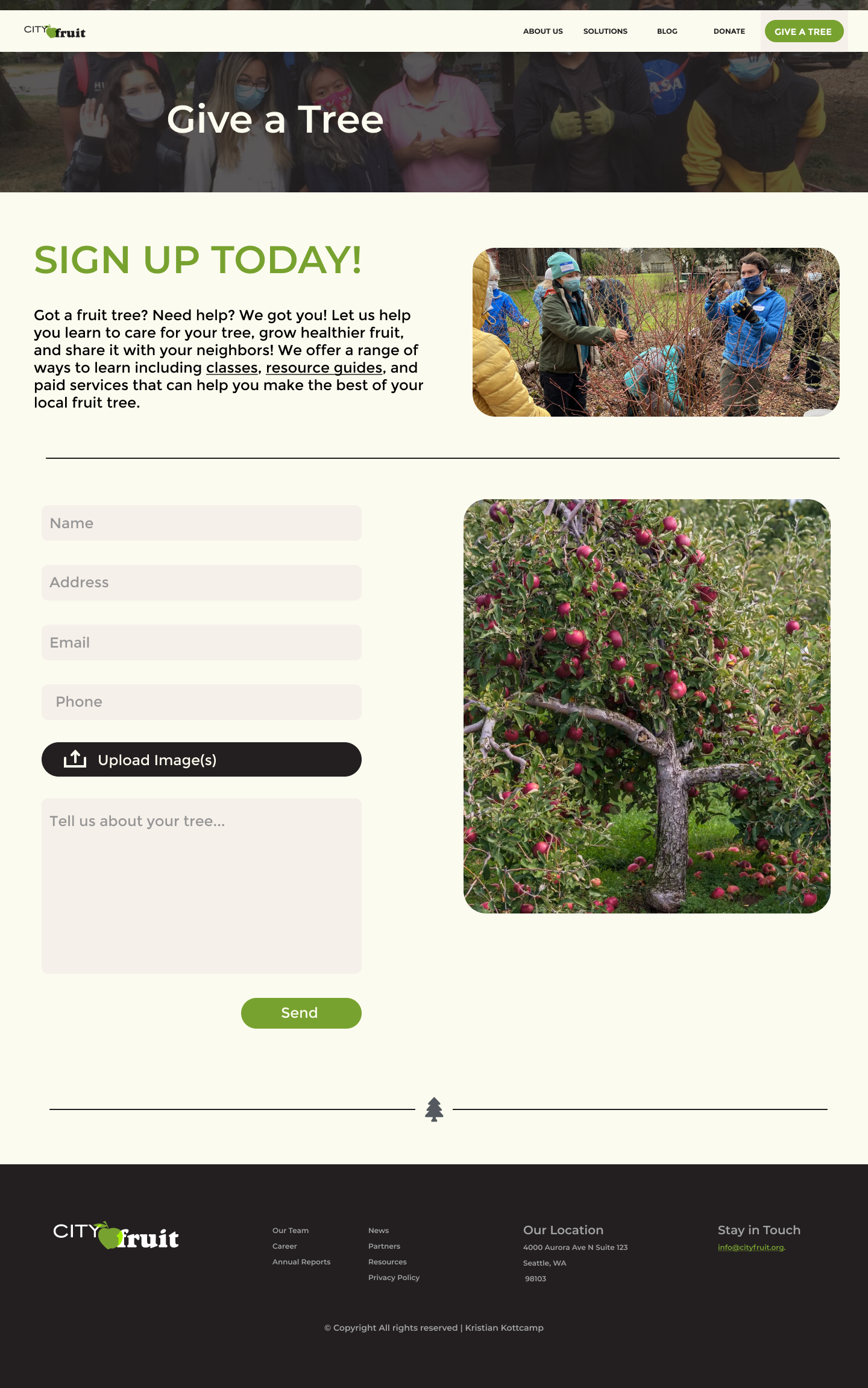
To redesign the City Fruit website to better accomplish its main purpose, teach users about the org and guide them to sign up for “GIVE A TREE”.
Audience
City Fruit’s target audience includes urban residents of Seattle and surrounding areas who own property with fruit trees on them, most likely middle aged, financially able own a house, and who are charitable enough to want to sign up for such a program to help those in need.
Key Message
City Fruit is a community-based non-profit organizations dedicated to promoting healthy and sustainable urban ecosystems by harvesting and caring for fruit trees in the Seattle metropolitan area.
THE OBJECTIVE
Clear and concise information about the organization and its mission.
Information about how to get involved (e.g. volunteering and donating).
Information about City Fruit’s programs and initiatives.
Resources for urban fruit tree care and harvesting.
Easy-to-use navigations.
Engaging and visually appealing design.
Information about how to get involved (e.g. volunteering and donating).
Information about City Fruit’s programs and initiatives.
Resources for urban fruit tree care and harvesting.
Easy-to-use navigations.
Engaging and visually appealing design.
Based on my research, the visitor is most likely to first discover CityFruit’s website from online articles, social media, or word of mouth. Most users will reach it via link rather than web search, thus will likely already have a basic understanding of what City Fruit actually does.
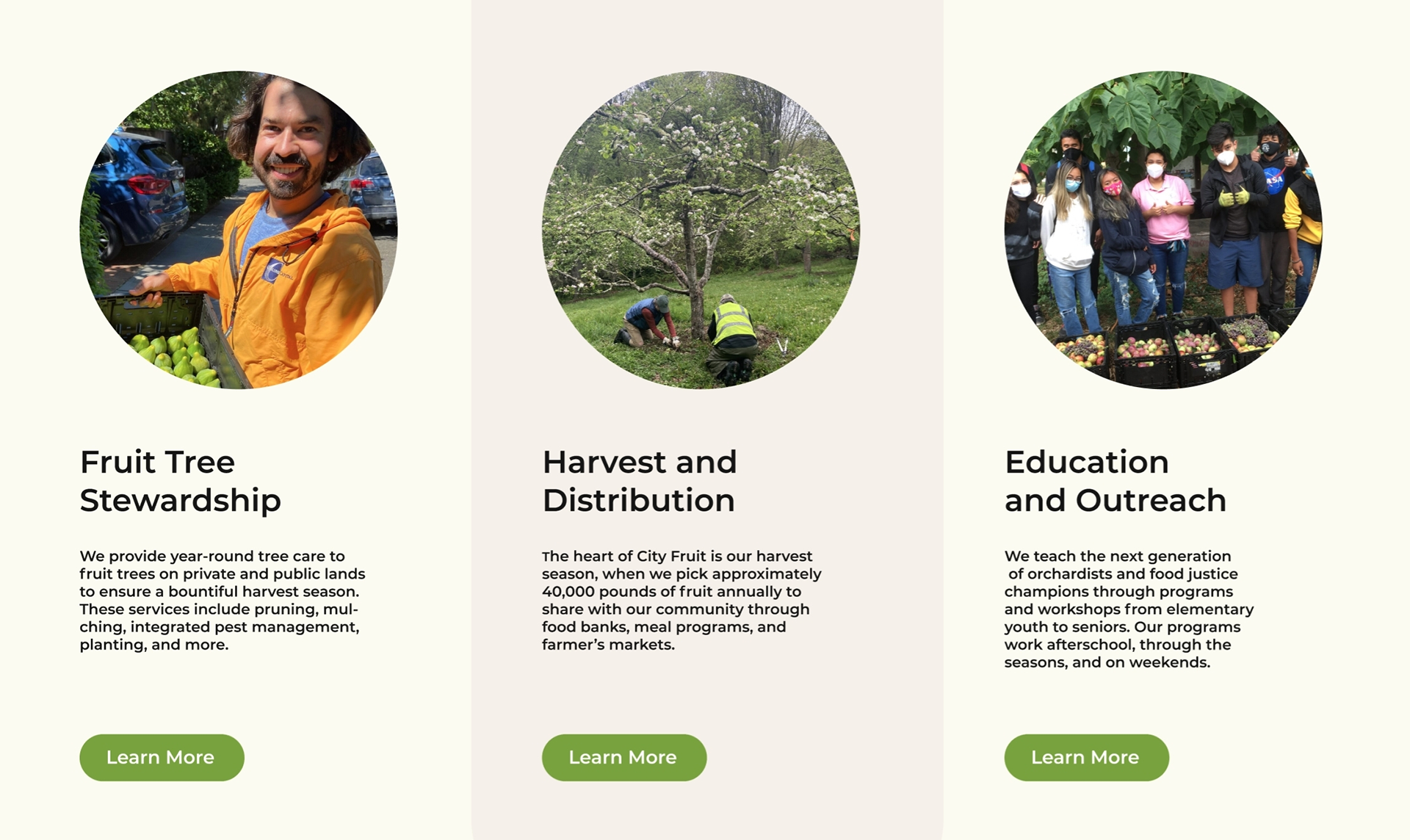
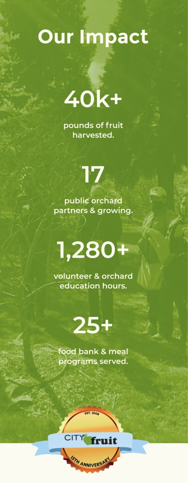
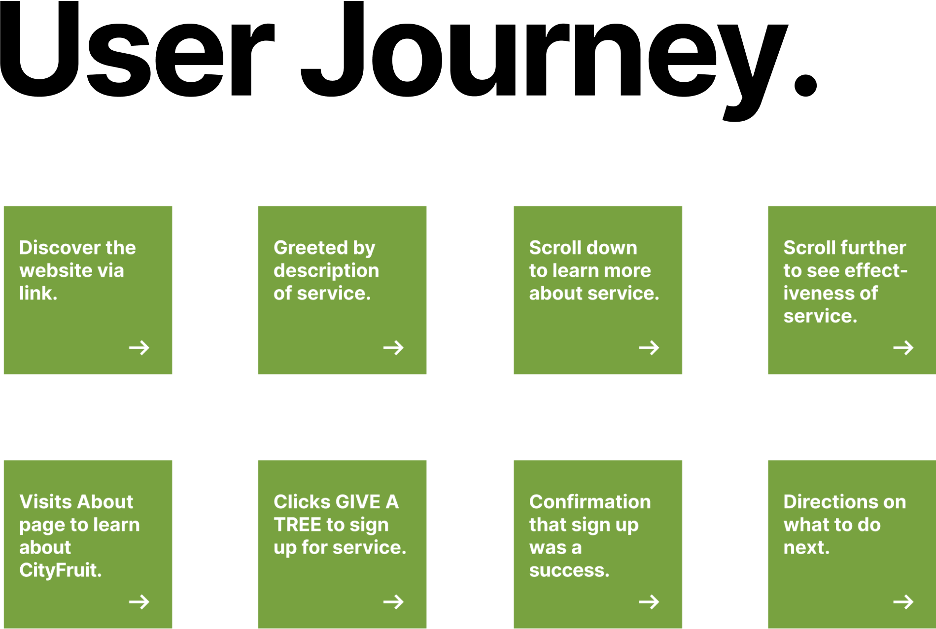
When they first enter the website, the visitor will be greeted with a reiteration of the NGO’s tree harvest program with a direct link to sign up. Scrolling down the home page will have links to specific information about the program for user’s who wish to learn more, as well as statistics about City Fruit’s success with the program to demonstrate its effectiveness.
Users who wish to learn more about City Fruit itself can visit the About, Solutions, and Blog pages where they will be convinced that it is a real organization with history and it’s projects are actively ongoing, and also shows that they can be trusted to come to the user’s private property.
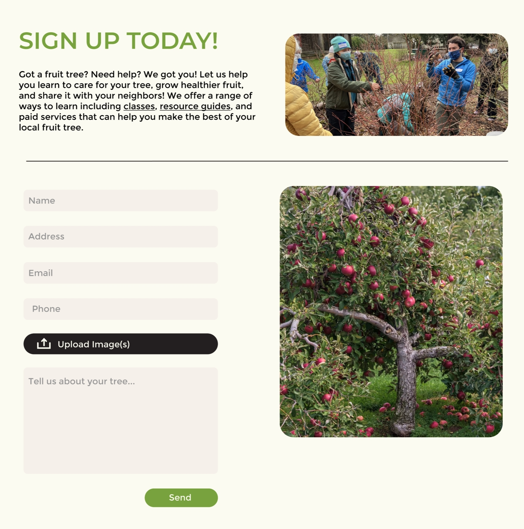
After being convinced that joining the tree harvesting pro-gram is a good thing that can help people, and that City Fruit is an organization that can be trusted, the user will simply click the GIVE A TREE button on the navbar. They will be brought to the sign-up page to fill out an application to donate their fruit tree.
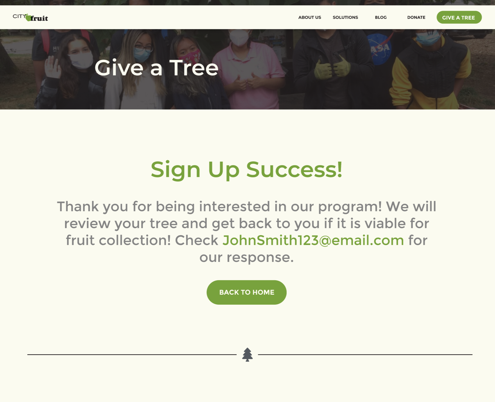
After clicking send, they will be sent to a confirmation page that shows the application was successfully sent and provides instruction to check their email for a response from City Fruit.
When they first enter the website, the visitor will be greeted with a reiteration of the NGO’s tree harvest program with a direct link to sign up. Scrolling down the home page will have links to specific information about the program for user’s who wish to learn more, as well as statistics about City Fruit’s success with the program to demonstrate its effectiveness.
Users who wish to learn more about City Fruit itself can visit the About, Solutions, and Blog pages where they will be convinced that it is a real organization with history and it’s projects are actively ongoing, and also shows that they can be trusted to come to the user’s private property.
After being convinced that joining the tree harvesting pro-gram is a good thing that can help people, and that City Fruit is an organization that can be trusted, the user will simply click the GIVE A TREE button on the navbar. They will be brought to the sign-up page to fill out an application to donate their fruit tree.
After clicking send, they will be sent to a confirmation page that shows the application was successfully sent and provides instruction to check their email for a response from City Fruit.
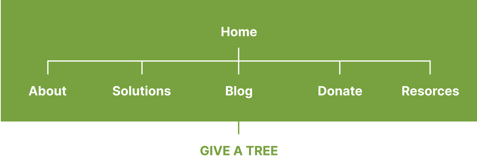
Site Map
The site map has been simplified down to prioritize core, relevant, information first while additional information can be found within the footer.
The GIVE A TREE page can be accessed from any page via the navbar which is highlighted to encourage users to check it out as that is the main service of the organization.
All other information that is not relevant enough, or that is better off accessed through direct reach out has been removed in order to clear clutter from the site.
Design Process.
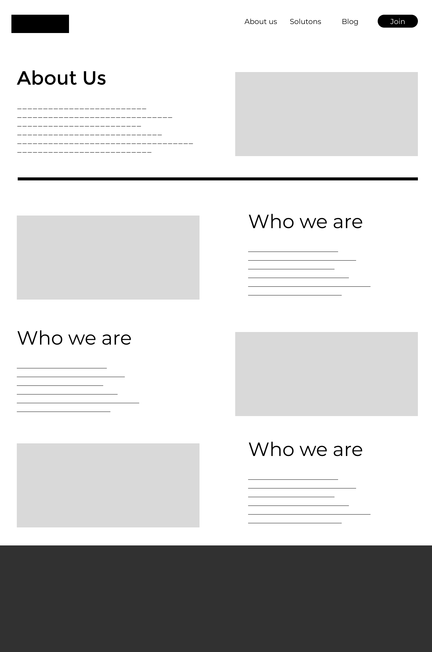
Desktop Wireframes
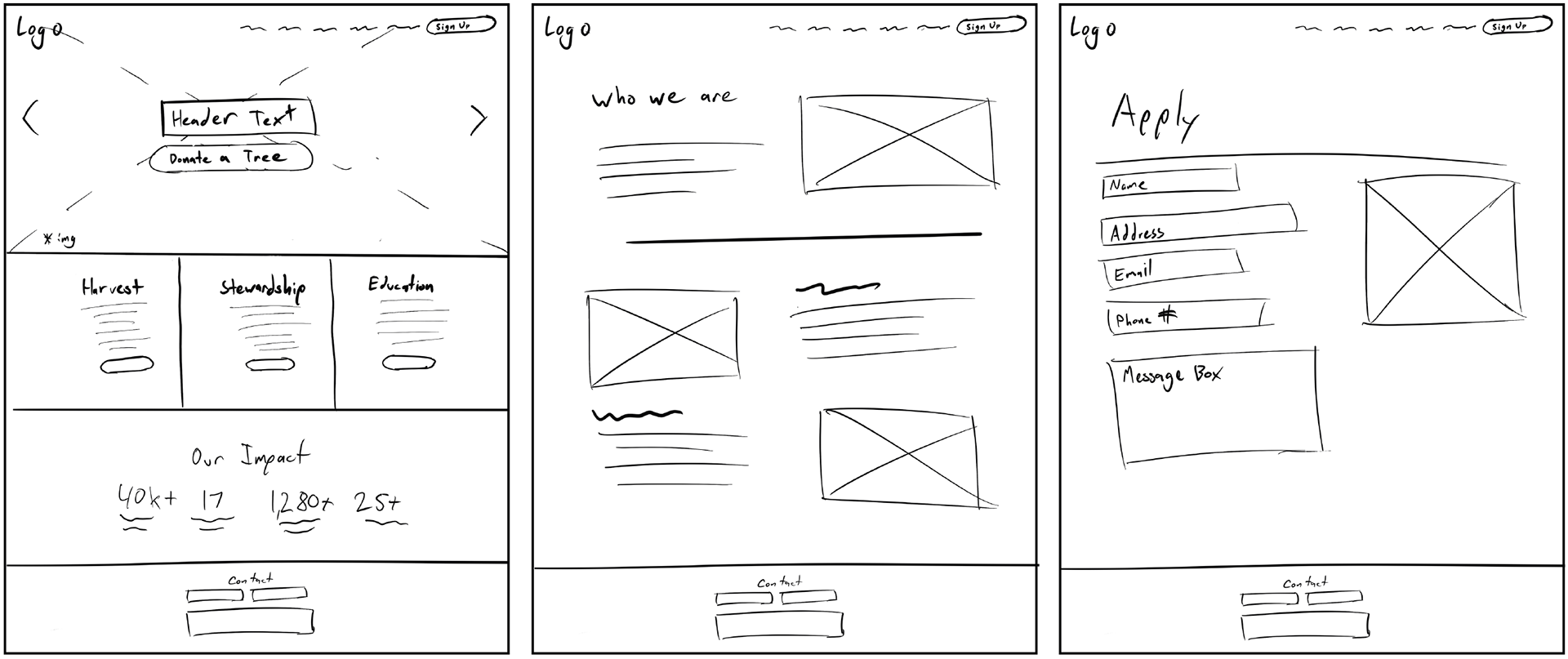
Desktop Wireframes
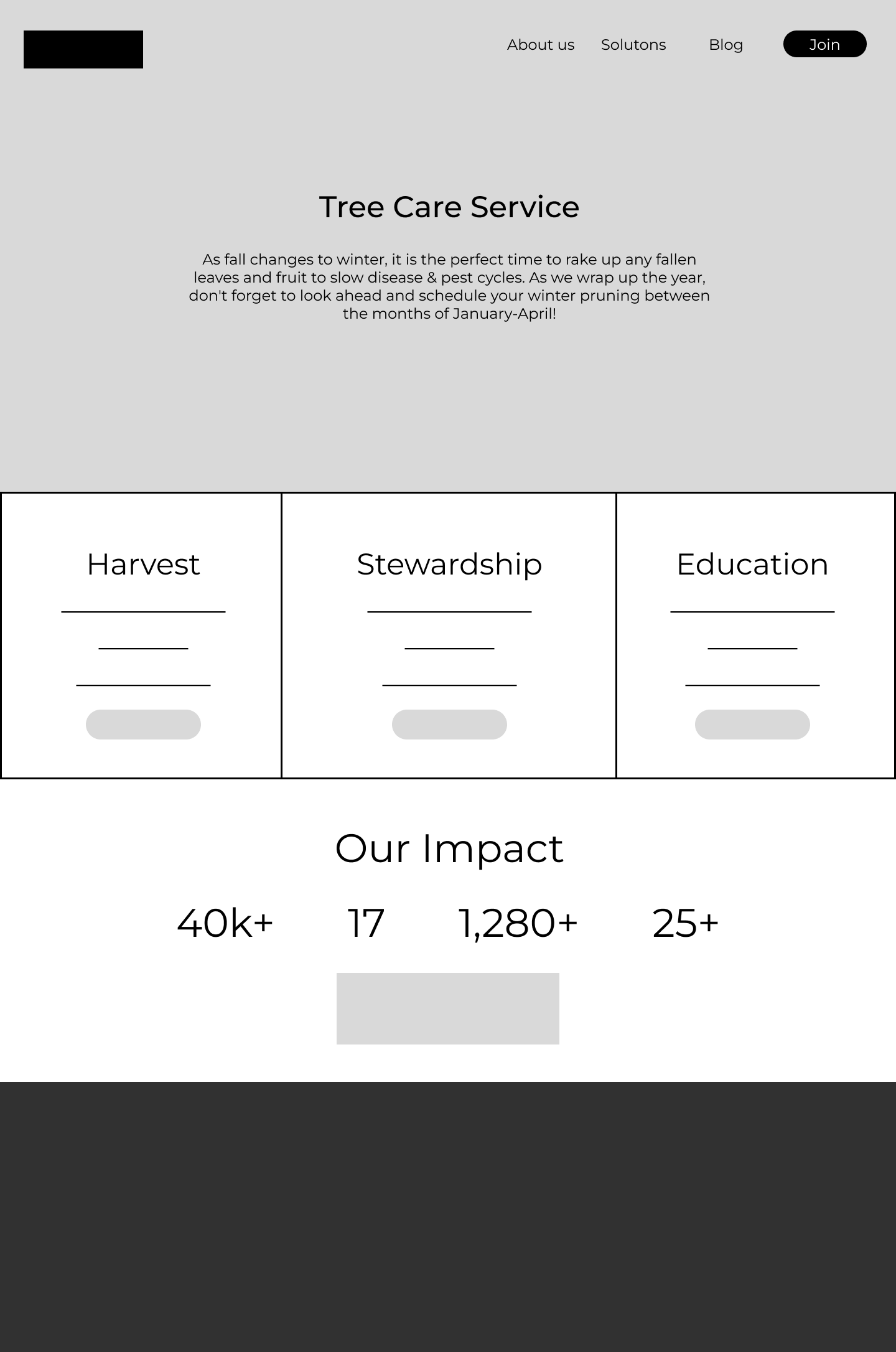
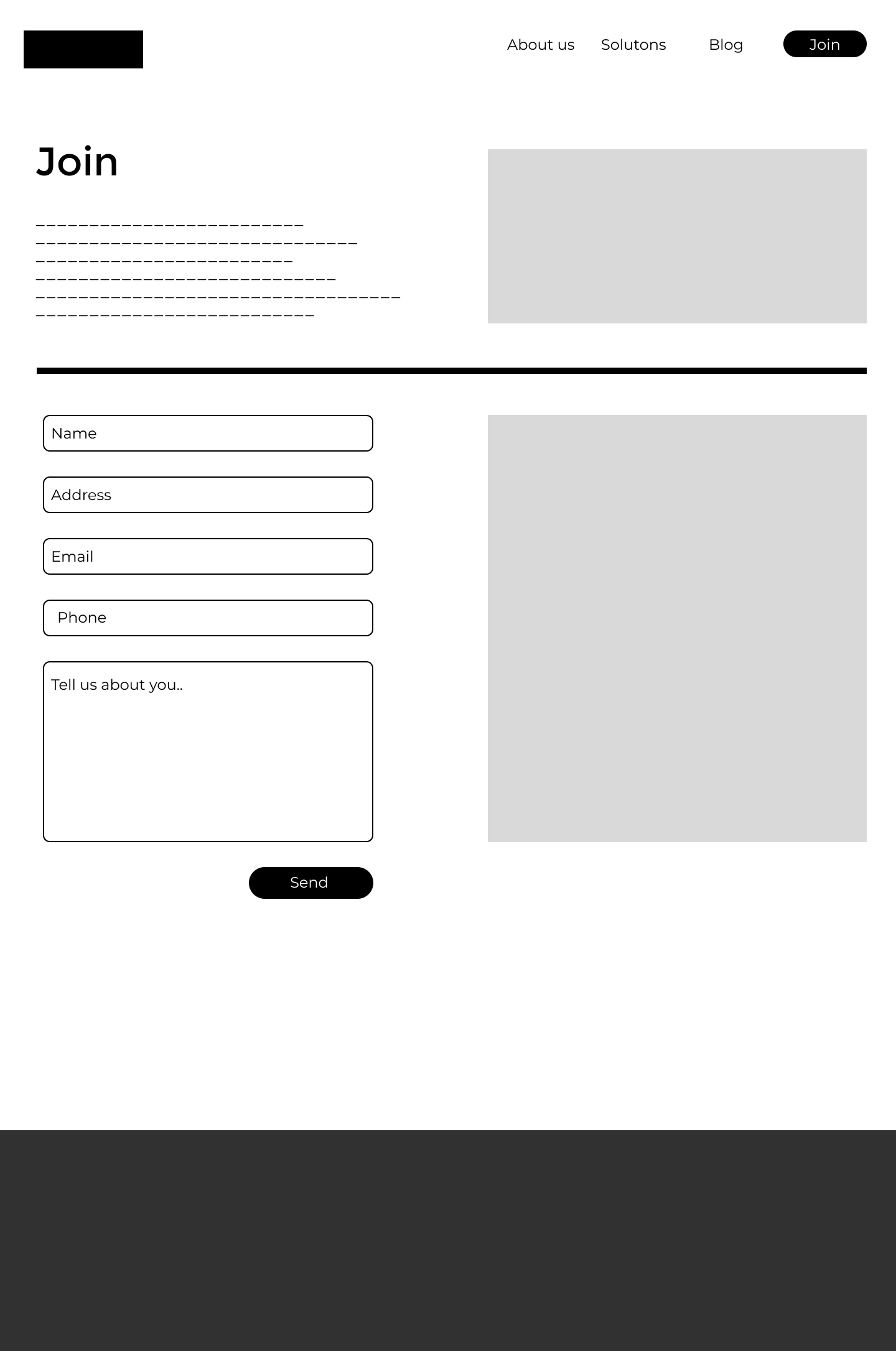
After conducting user testing and receiving feedback, I found that people weren’t quite sure what Join/Sign up meant, they thought it making an account on the site rather than signing up for the service. To fix this I renamed it, GIVE A TREE to make it clearer what the application was for.
Additionally when adding in the actual text copy, I realized there was too much text on the About page to fit the lofi design so I had to change the layout.
Additionally when adding in the actual text copy, I realized there was too much text on the About page to fit the lofi design so I had to change the layout.
Desktop Hifi Prototype
Translating to Mobile
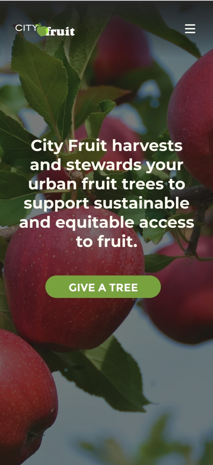
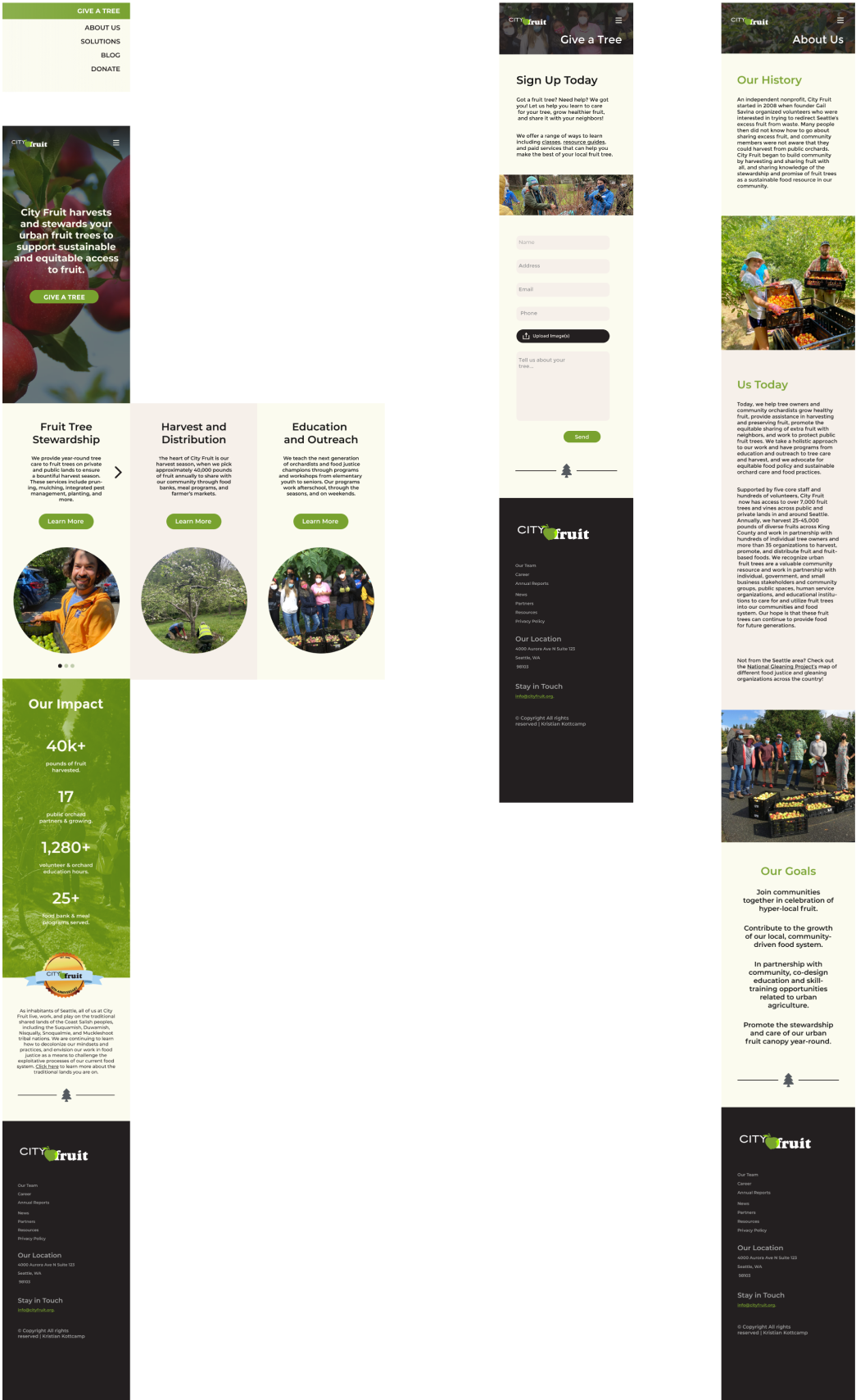
Converting to mobile at first seemed fairly straight forward, I had the same layout as desktop mostly except further scrolling, with three info cards on the main menu in a vertical position. However, upon review, I realized that this caused to much scrolling. Instead, I turned them into a carousel which made the overall page scrolling much shorter. I would go on to make further changes after more user testing.

Mobile hifi
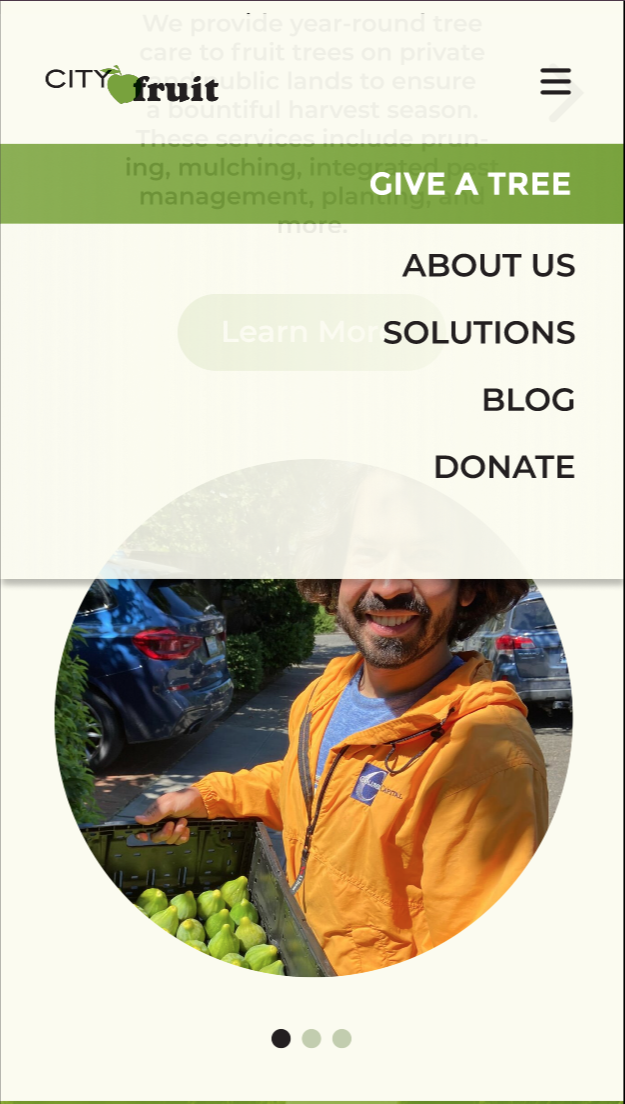
I received additional feedback from user testing on the Hifi mobile prototype. The testers seemed to have issue with the nav menu taking up too much space when in the dropdown state. To fix this I made it semitransparent on one side to allow for most of the screen to still be visible while still having background for the nav menu.
I also created two different versions of each page, one with a translucent navbar and one with a solid with drop shadow that would automatically swap in once the user scrolls further down the page to make sure it doesn’t blend in with other assets.
I also created two different versions of each page, one with a translucent navbar and one with a solid with drop shadow that would automatically swap in once the user scrolls further down the page to make sure it doesn’t blend in with other assets.
Mobile Hifi Prototype
Reflection.
It was critical to the project success to conduct thorough research before beginning the design process. Understanding the goals and target audience of the website were crucial for making design decisions that effectively communicated CityFruit’s mission.
It was also a challenge balancing aesthetics and functionality, both to satisfy the organization and the potential visitors/donors. To successfully get visitors to sign up for the program, the website had to be visually appealing, user-friendly and provide easy access to important information moved in order to clear clutter from a site.
It was also a challenge balancing aesthetics and functionality, both to satisfy the organization and the potential visitors/donors. To successfully get visitors to sign up for the program, the website had to be visually appealing, user-friendly and provide easy access to important information moved in order to clear clutter from a site.